library(tidyverse)
#library(vdemlite)
library(vdemdata)
myData <- vdem %>%
   filter(year == 2022)  %>%  # filter to only include the year 2020
  mutate(region = e_regionpol_6C) %>%   ## make a better region variable
  mutate(region = case_match(region,    # new variable called region
                        1 ~ "Eastern Europe",
                        2 ~ "Latin America",
                        3 ~ "Middle East",
                        4 ~ "Africa",
                        5 ~ "The West",
                        6 ~ "Asia")) %>%
select(country_name, year, v2x_egaldem, v2x_polyarchy, v2x_delibdem, region, v2x_regime, e_peaveduc)Bar Charts
January 29, 2025
Bar Charts
When do we want to use bar charts?
Bar charts are very common in data viz
Usually, when we want to compare the value of a numerical variable (GDP per capita, etc) across different values of a categorical variable
When do we want to use bar charts?
Examples:
How does GDP per capita vary across world regions? [GDP per capita is numerical and world region is categorical]
Voteshare for Trump in different US states?
Example for today:
- Level of democracy (measured continuously) by world region
The Grammar of Graphics
- Data viz has a language with its own grammar
- Basic components include:
- Data we are trying to visualize
- Aesthetics (dimensions)
- Geom (e.g. bar, line, scatter plot)
- Color scales
- Themes
- Annotations
Get the data
Calculate mean of Egalitarian Democracy by Region
# create summary data object
dem_summary <- myData%>%
  group_by(region) %>%
  summarize(mean_egal_dem = mean(v2x_egaldem, na.rm=TRUE))
dem_summary
# A tibble: 6 × 2
region mean_egal_dem
<chr> <dbl>
1 Africa 0.269
2 Asia 0.304
3 Eastern Europe 0.419
4 Latin America 0.399
5 Middle East 0.189
6 The West 0.753The Grammar of Graphics
- Data viz has a language with its own grammar
- Basic components include:
- Data we are trying to visualize
- Aesthetics (dimensions)
- Geom (e.g. bar, line, scatter plot)
- Color scales
- Themes
- Annotations
Let’s start with the first two, the data and the aesthetic…
This gives us the axes without any visualization:

You can also pipe the data into ggplot…
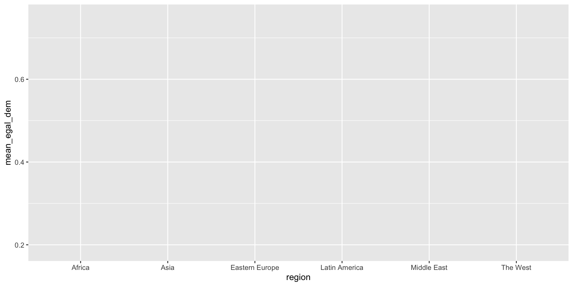
Now let’s add a geom. In this case we want a bar chart so we add geom_col(). Note that with ggplot we add, we do NOT pipe
That gets the idea across but doesnt look great…
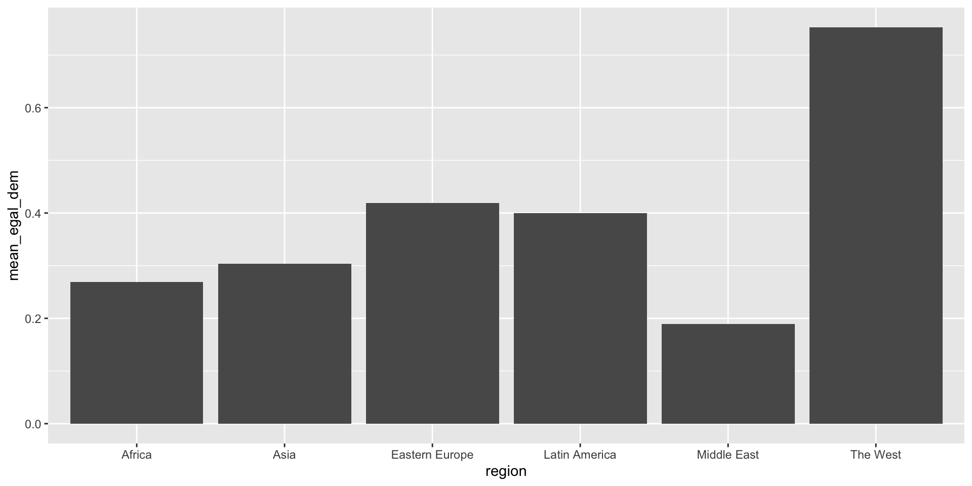
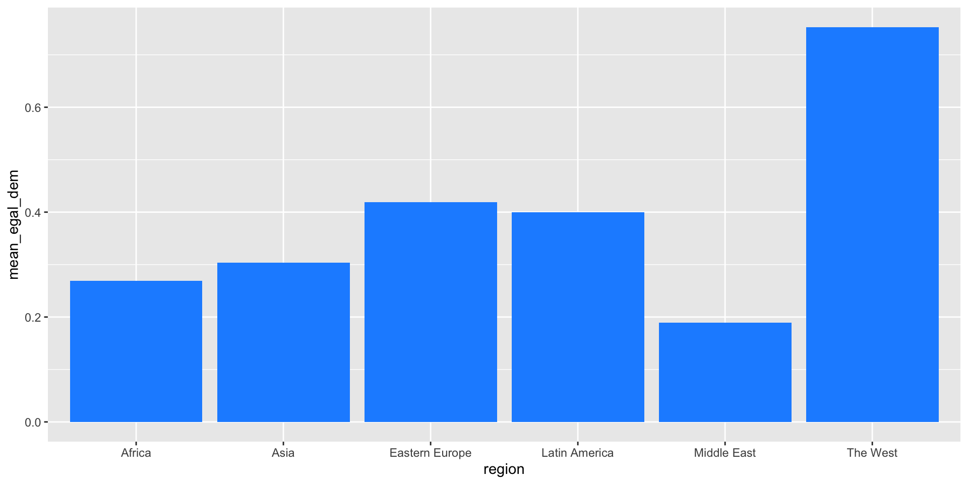
…let’s change the color of the bars by specifying fill = "dodgerblue".
Note how color of original bars is simply overwritten:
Now let’s add some labels with the labs() function:
And that gives us…
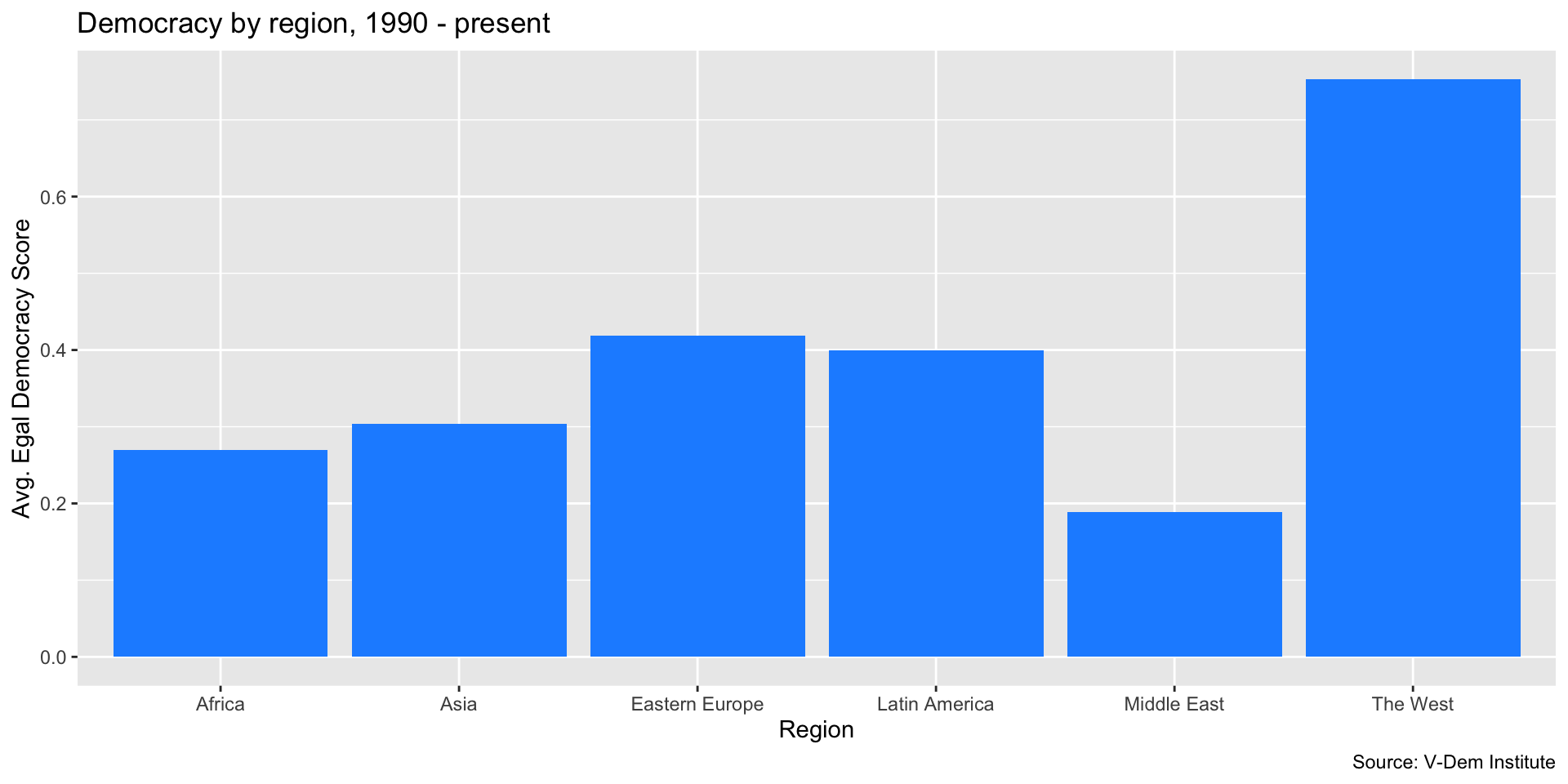
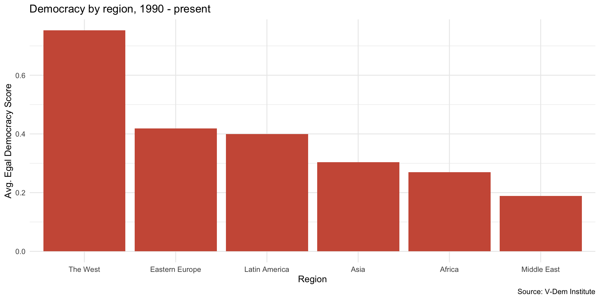
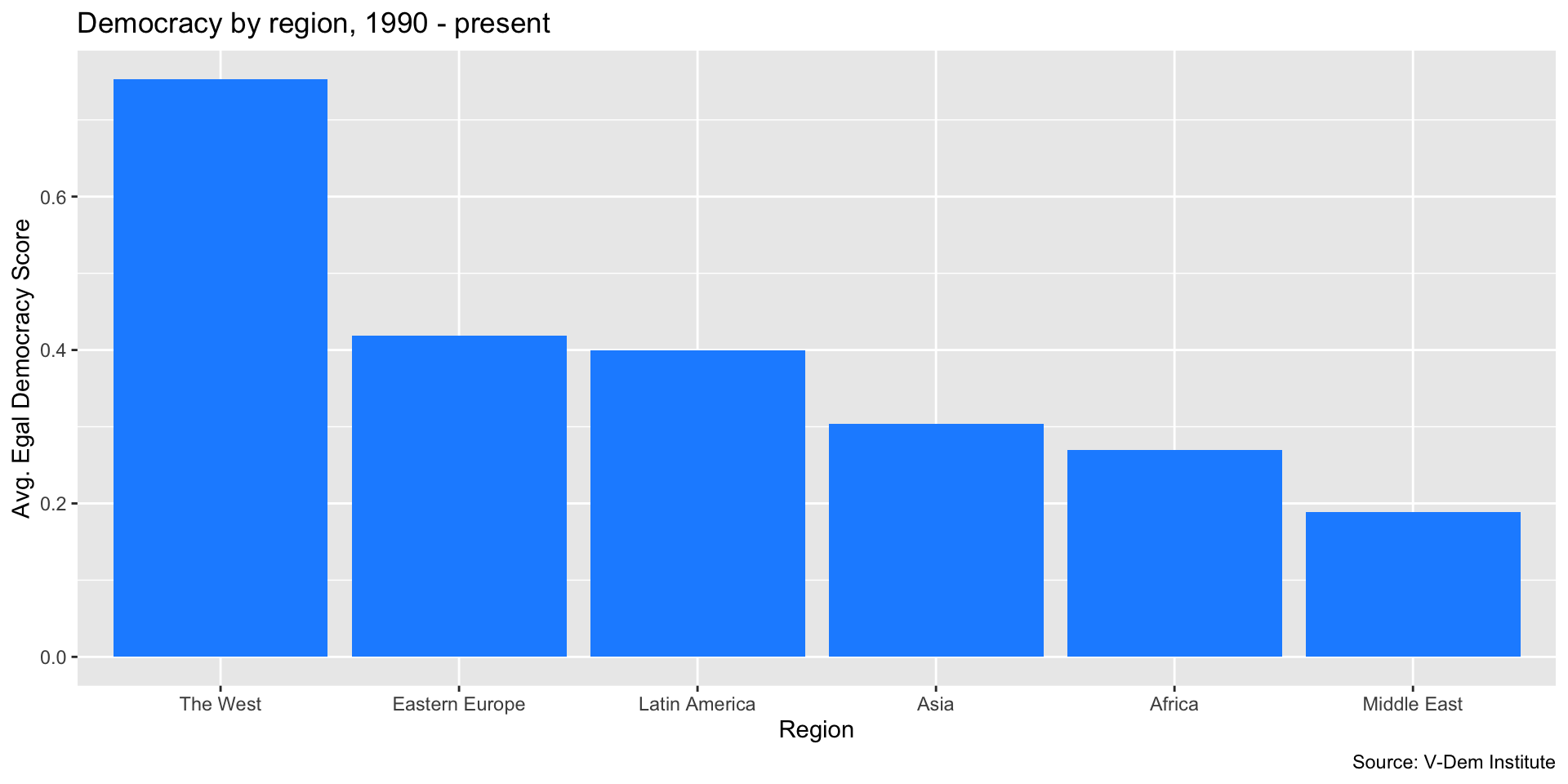
Next, we reorder the bars with fct_reorder() from the forcats package.
This way, we get a nice ordering of the bars according to levels of democracy, which in this case is helpful for interpretation…
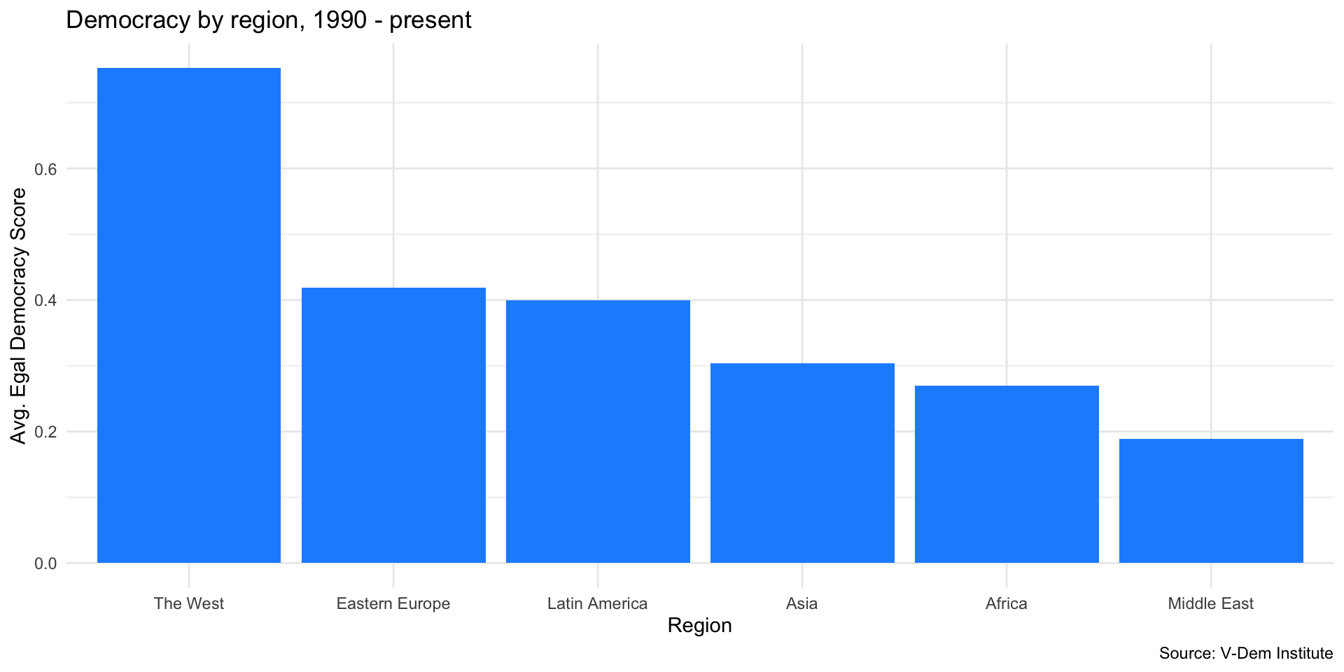
Now let’s change the theme to theme_minimal().
Better…
You can also save your plot as an object to modify or use later.
Which gives us…

You can also build up sequentially
You can also build up sequentially
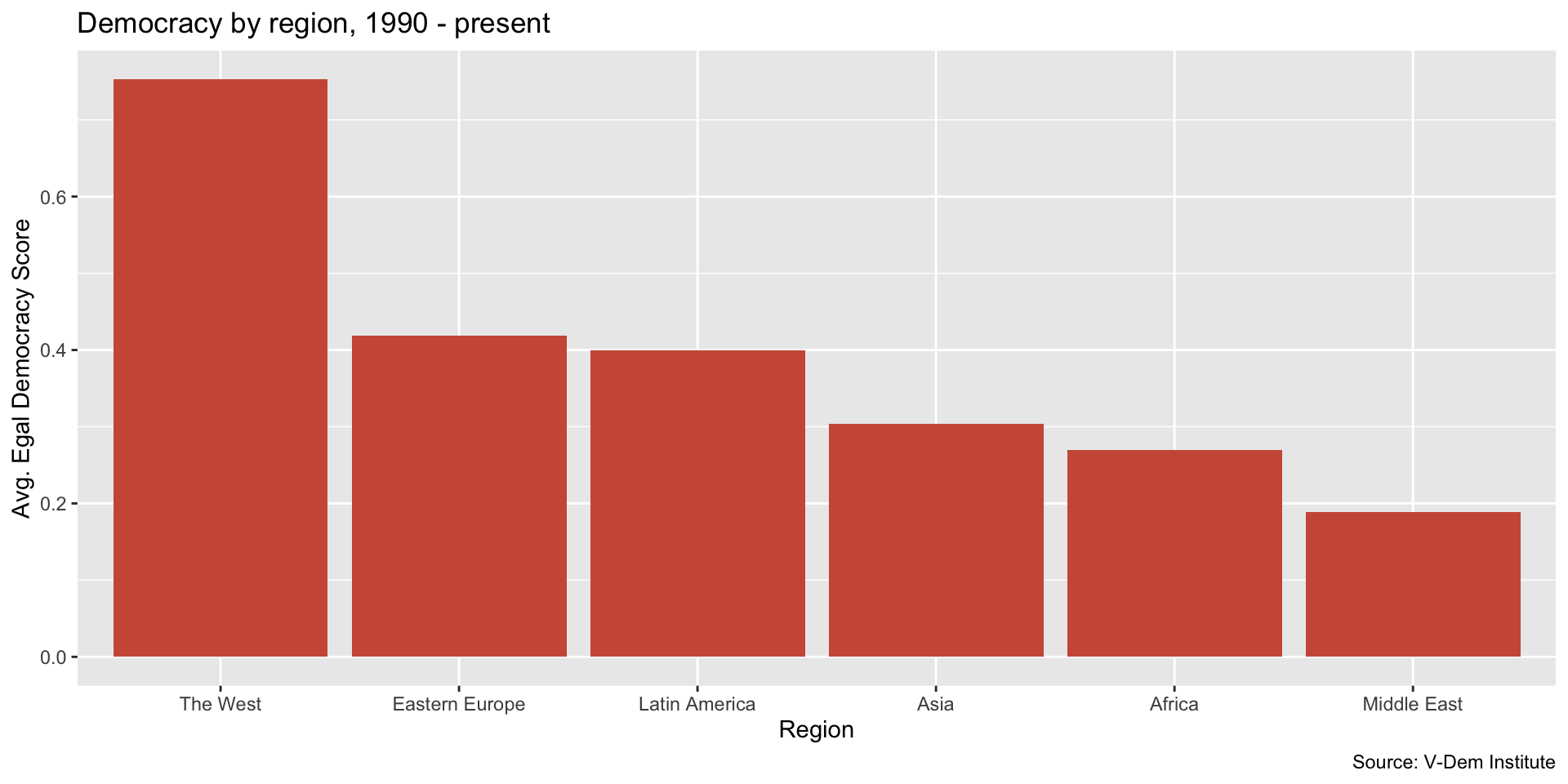
Add a theme
