library(tidyverse)
library(vdemdata)
myData <- vdem %>%
  mutate(region = e_regionpol_6C) %>%   ## make a better region variable
  mutate(region = case_match(region,    # new variable called region
                        1 ~ "Eastern Europe",
                        2 ~ "Latin America",
                        3 ~ "Middle East",
                        4 ~ "Africa",
                        5 ~ "The West",
                        6 ~ "Asia")) %>%
select(country_name, year, v2x_egaldem, v2x_polyarchy, v2x_delibdem, region, v2x_regime, e_peaveduc)Line Charts & Scatter Plots
January 29, 2025
Line Plots
Mainly use line charts to display trends over time.
Data Setup
Data Setup
Line Chart
Line Chart
Use geom_line() to specify line chart
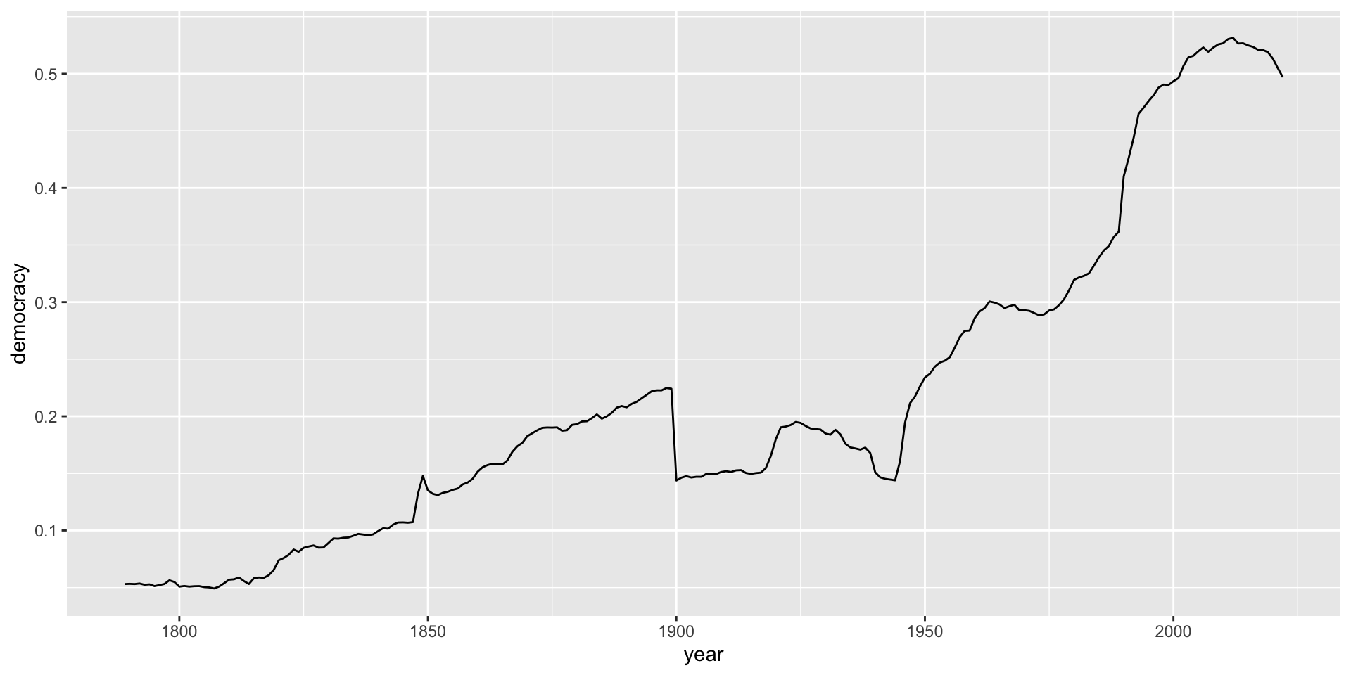
Add some labels
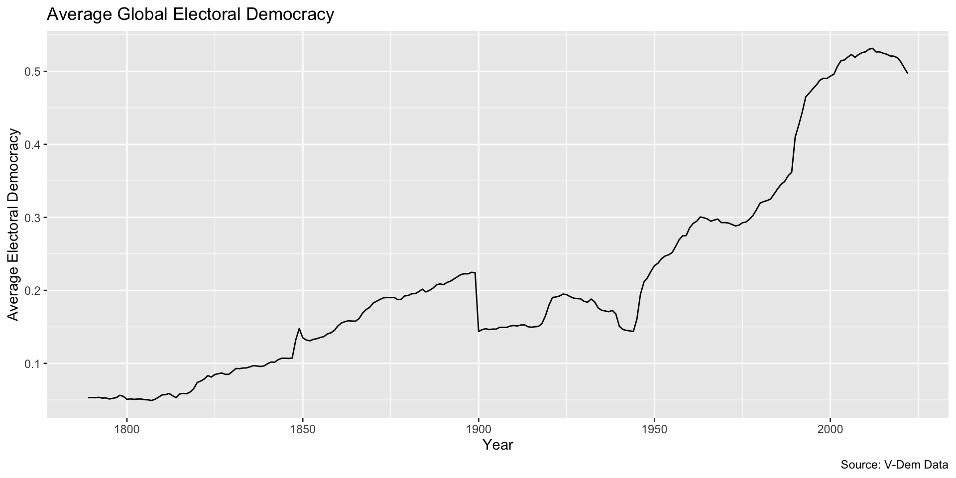
Choose a theme you like, and maybe change some colors
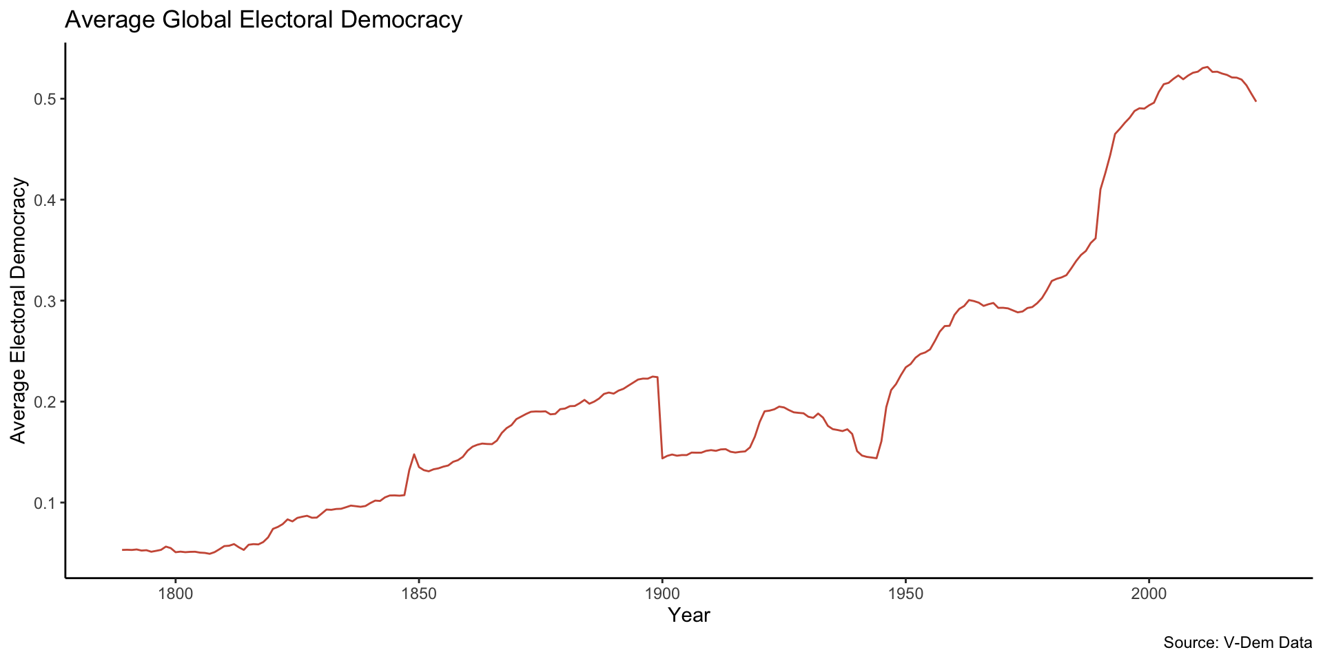
Add another dimension
Plot by world region: We need to recreate the data
lineDataRegion <- myData %>%
  group_by(year, region) %>%
  summarize(democracy = mean(v2x_polyarchy, na.rm = TRUE))
glimpse(lineDataRegion)
Rows: 1,404
Columns: 3
Groups: year [234]
$ year <dbl> 1789, 1789, 1789, 1789, 1789, 1789, 1790, 1790, 1790, 1790, …
$ region <chr> "Africa", "Asia", "Eastern Europe", "Latin America", "Middle…
$ democracy <dbl> 0.01000000, 0.02587500, 0.09600000, 0.03077778, 0.01942857, …Add color = region to aes; remove color from geom_line(); update data; update legend
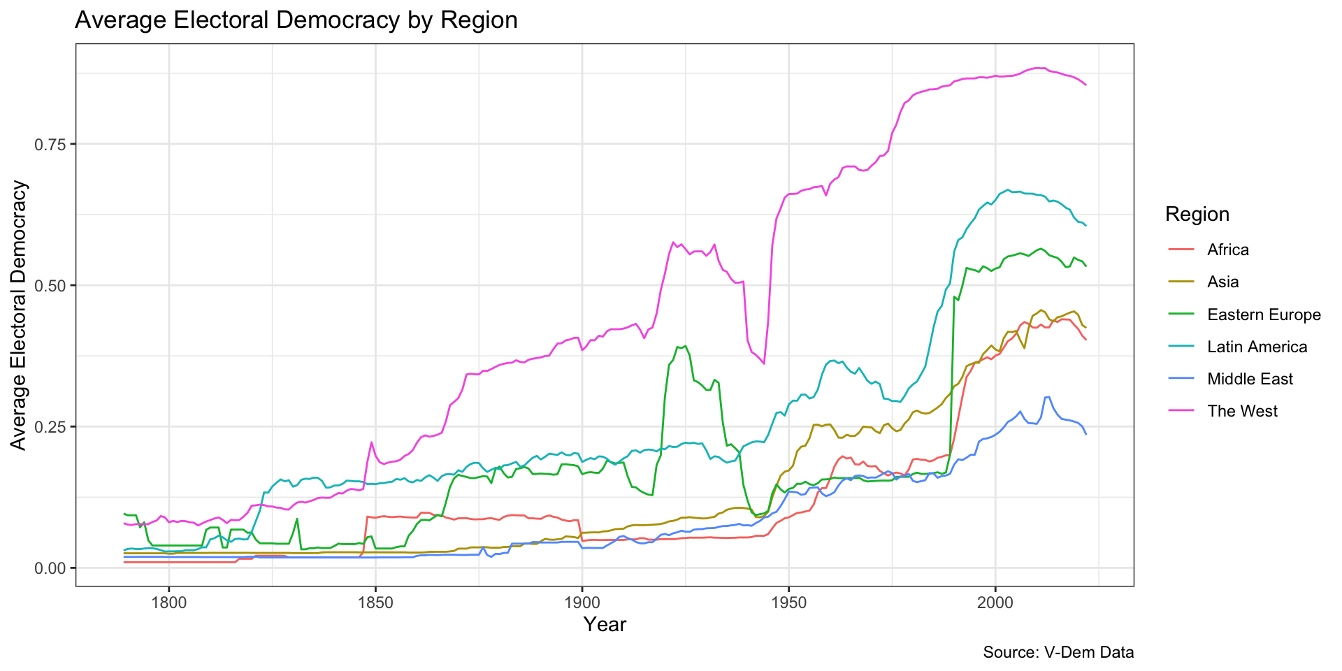
Color Blindness
- Color Vision Deficiency (CVD) or color blindness affects 8 percent of men and 1 in 200 women (including me!)
- There are different types of CVD but most common is red-green color blindness
- Therefore, don’t include red and green in the same chart!
- Look for color blind safe palettes
Solution: Use a colorblind safe color scheme like viridis…
Code
ggplot(lineDataRegion, aes(x = year, y = democracy, color = region)) +
  geom_line() +
  labs(x = "Year",
       y = "Average Electoral Democracy",
       title = "Average Electoral Democracy by Region",
       caption = "Source: V-Dem Data",
       color = "Region") +
theme_bw() +
scale_color_viridis_d(option = "inferno", end = .8) # use viridis color palette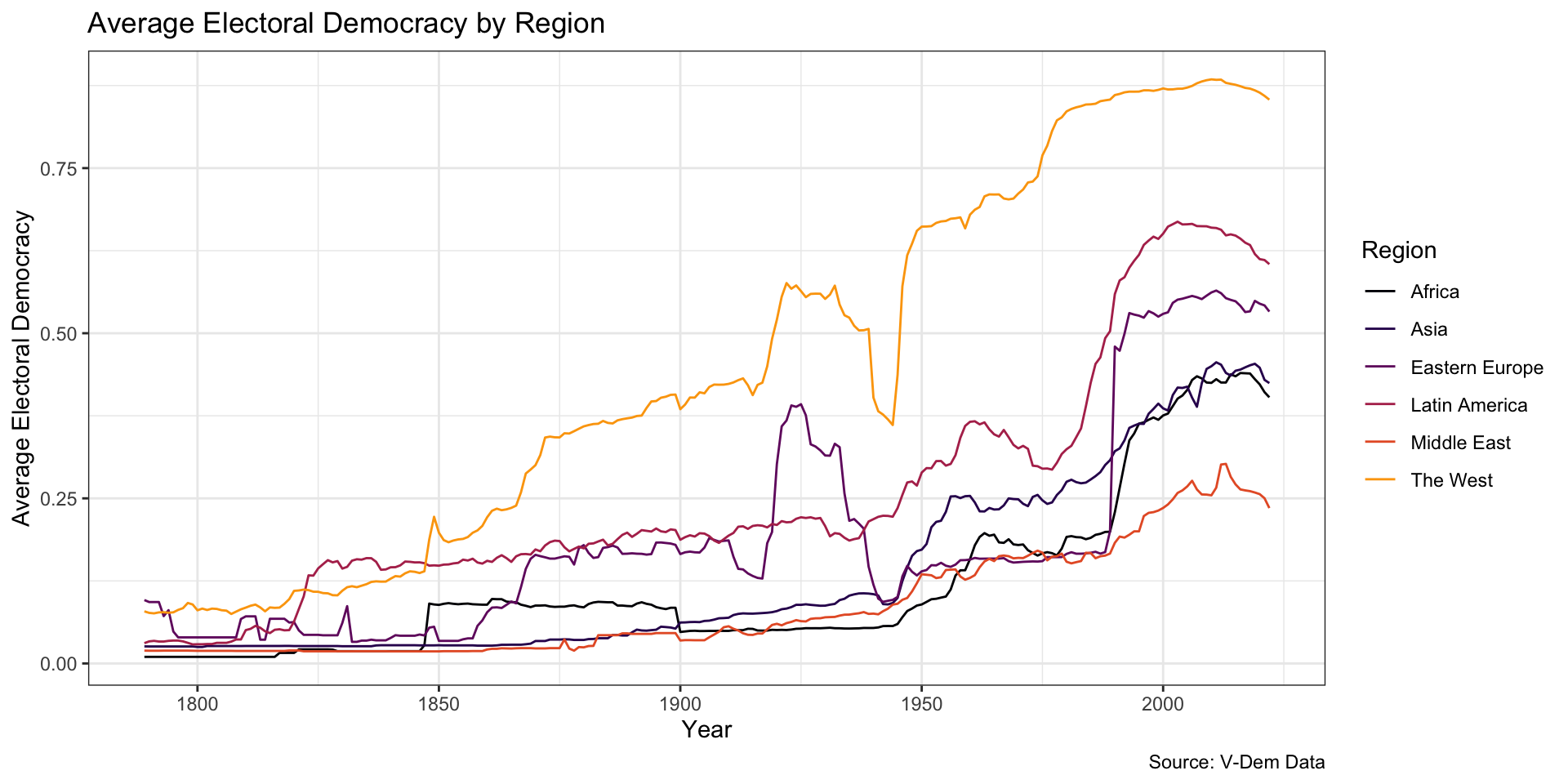
Palettes
- There are a number of viridis palettes
- See this reference to view different palettes and options
- You can also use
scale_color_viridis_c()to specify a continuous color scale - Also check out the paletteer package for easy access to many more palettes
Build your own line plot
Posit Cloud
Scatterplots
We use scatterplots to illustrate the relationship between two numerical variables
We can use color, shapes, and sizing to add dimensions
Scatter Plot Setup
myData <- vdem %>%
  filter(year == 2020) %>%
  mutate(region = e_regionpol_6C) %>%   ## make a better region variable
  mutate(region = case_match(region,    # new variable called region
                        1 ~ "Eastern Europe",
                        2 ~ "Latin America",
                        3 ~ "Middle East",
                        4 ~ "Africa",
                        5 ~ "The West",
                        6 ~ "Asia")) %>%
    select(country_name, year, v2x_egaldem, v2x_polyarchy, v2x_delibdem, region, v2x_regime, e_peaveduc)
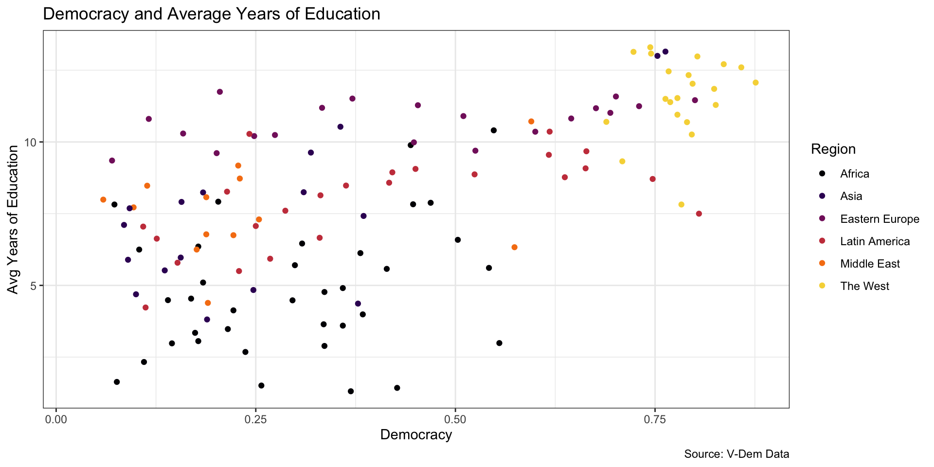
Democracy and Avg Yrs of Education
Democracy and Avg Yrs of Education
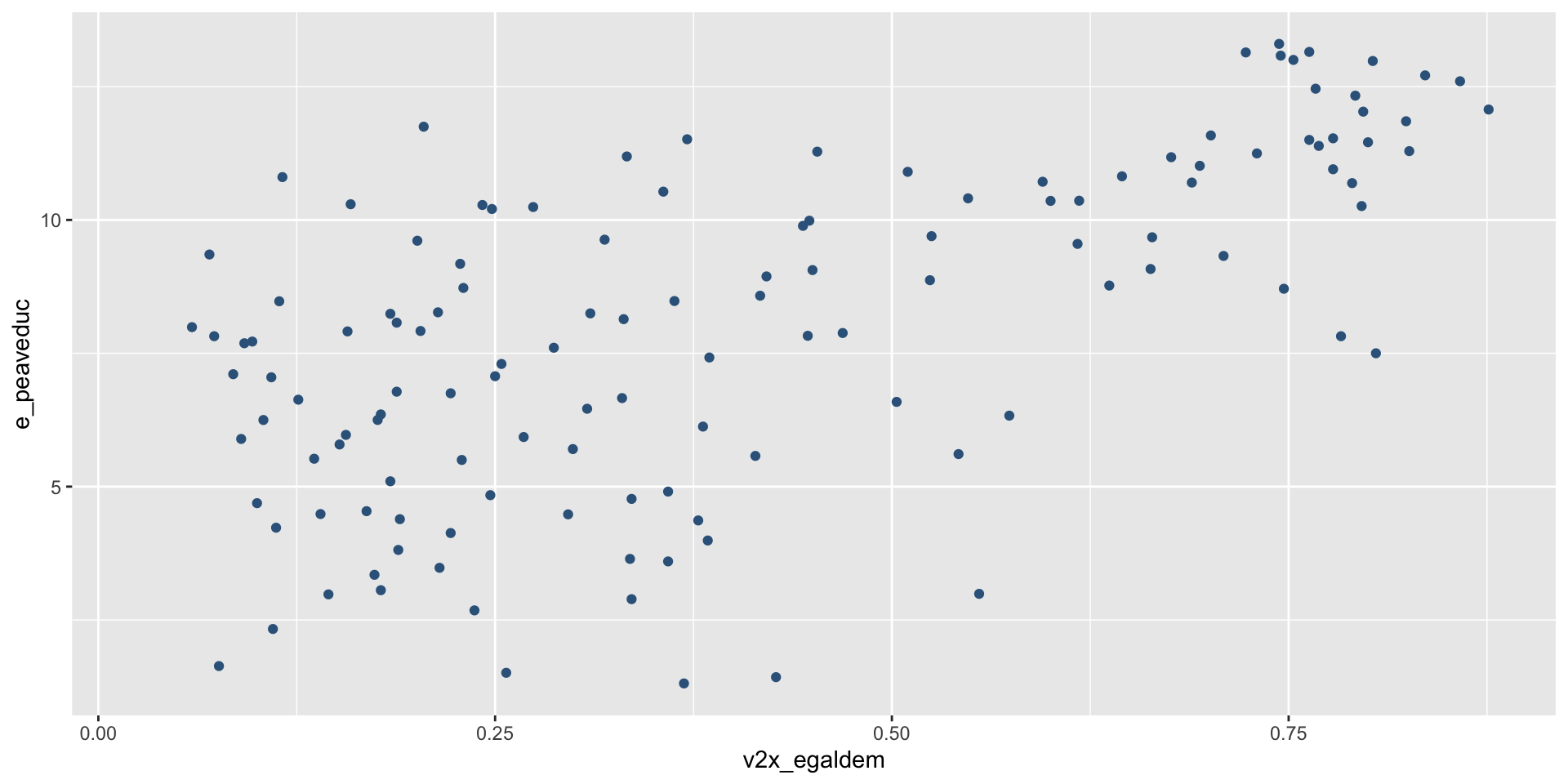
How should we interpret this?
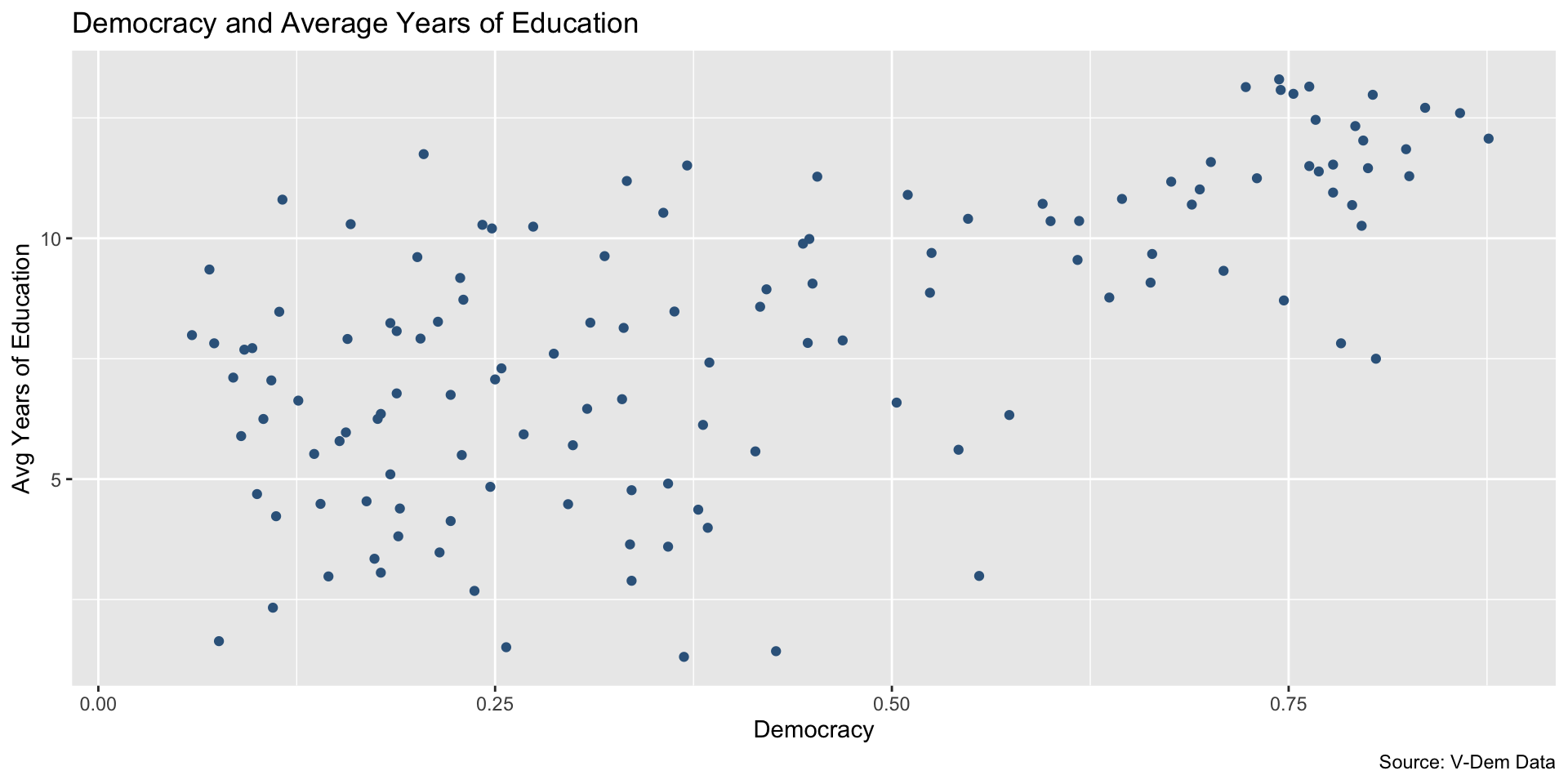
Trend line can help
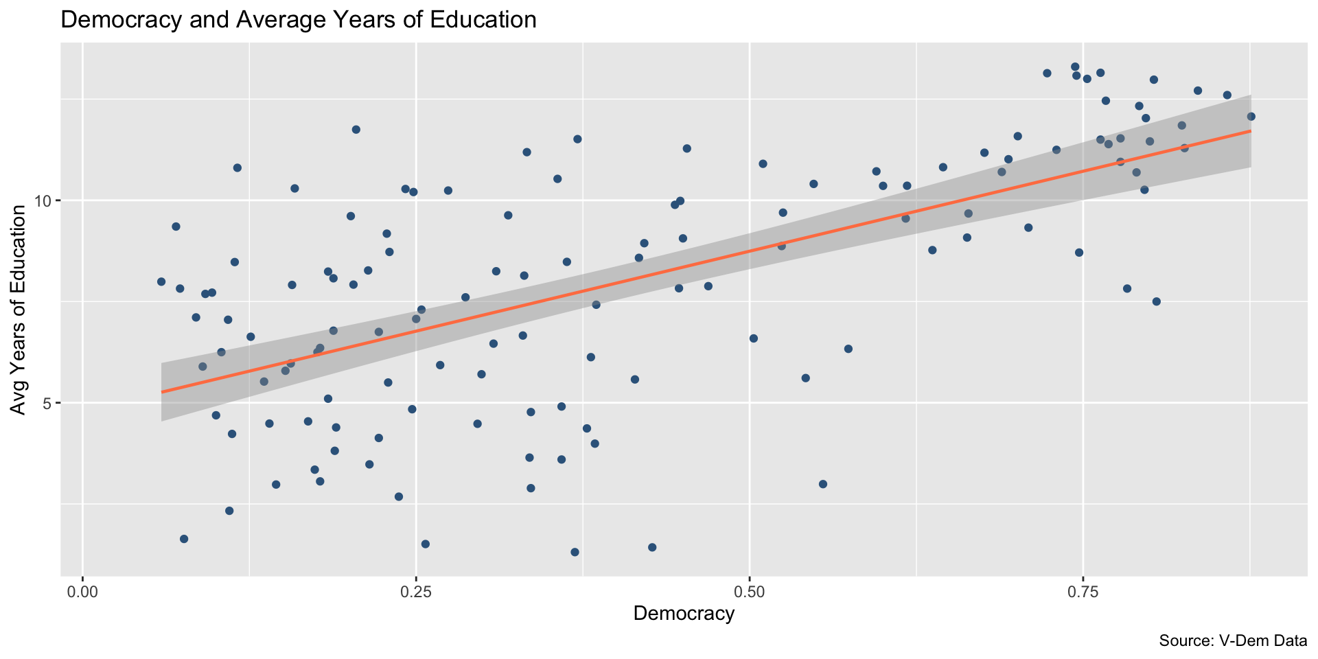
Add another dimension: Region
Code
ggplot(myData, aes(x = v2x_egaldem, y = e_peaveduc, color = region)) +
  geom_point() + # remember to remove color if addition color to aes!
  labs(x = "Democracy",
       y = "Avg Years of Education",
       title = "Democracy and Average Years of Education",
       caption = "Source: V-Dem Data",
       color = "Region") +
    scale_color_viridis_d(option = "inferno", end = .9)  +
  theme_bw()
Add another dimension: Region
Add trend line for each region
Code
ggplot(myData, aes(x = v2x_egaldem, y = e_peaveduc, color = region)) +
  geom_point() + # remember to remove color if adding color to aes!
  labs(x = "Democracy",
       y = "Avg Years of Education",
       title = "Democracy and Average Years of Education",
       caption = "Source: V-Dem Data",
       color = "Region") +
    scale_color_viridis_d(option = "inferno", end = .9) +
      geom_smooth(method = "lm", linewidth = .8, se = FALSE) +
  theme_bw()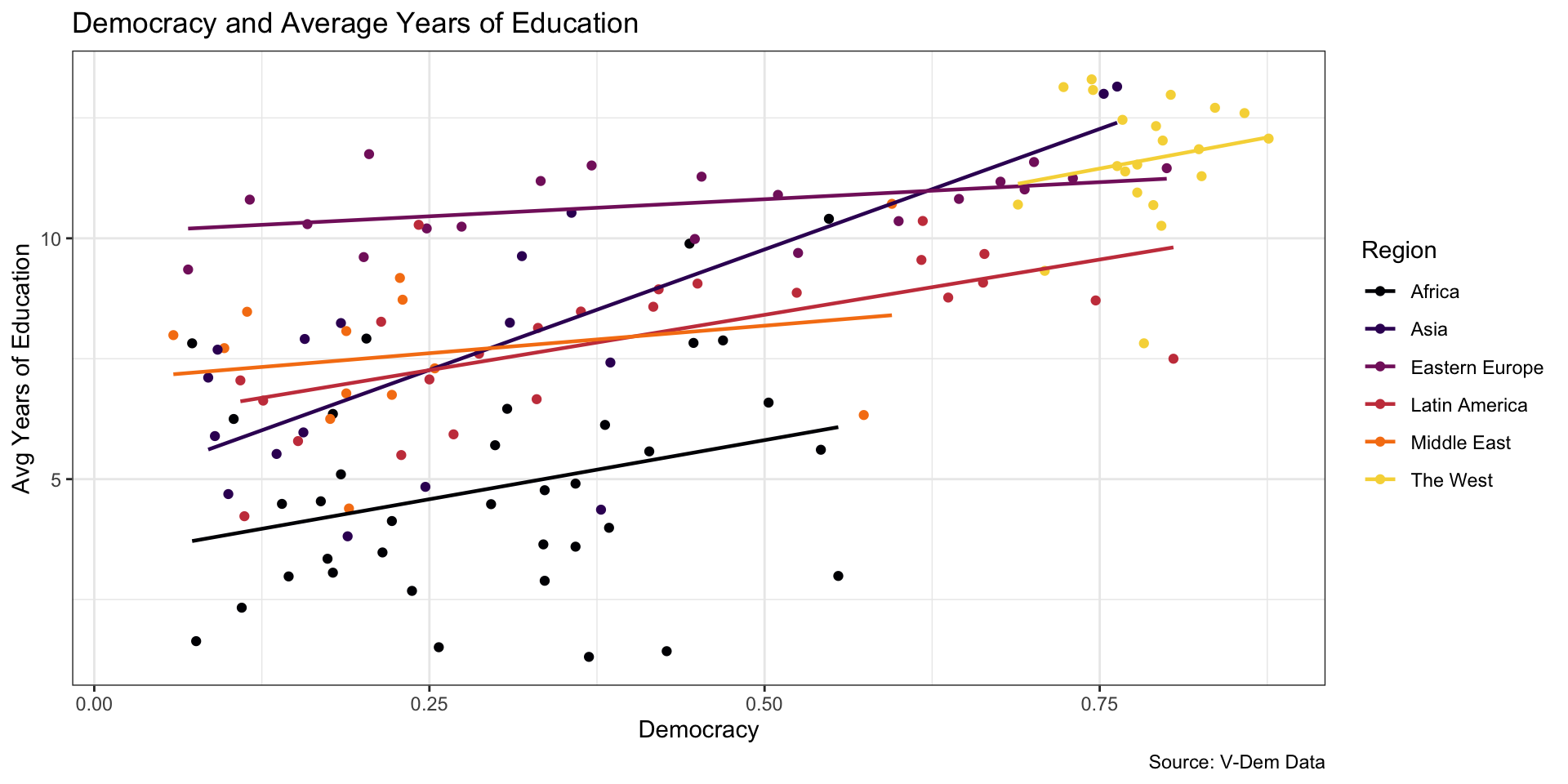
Facet Wrap can be helpful
ggplot(myData, aes(x = v2x_egaldem, y = e_peaveduc)) +
  geom_point(color = "steelblue") + # remember to remove color if addition color to aes!
  labs(x = "Democracy",
       y = "Avg Years of Education",
       title = "Democracy and Average Years of Education",
       caption = "Source: V-Dem Data",
       color = "Region") +
    scale_color_viridis_d(option = "inferno", end = .9) +
      geom_smooth(method = "lm", linewidth = .6, color = "coral", se = FALSE) +
  facet_wrap(~region) +
  theme_bw()
Facet Wrap can be helpful
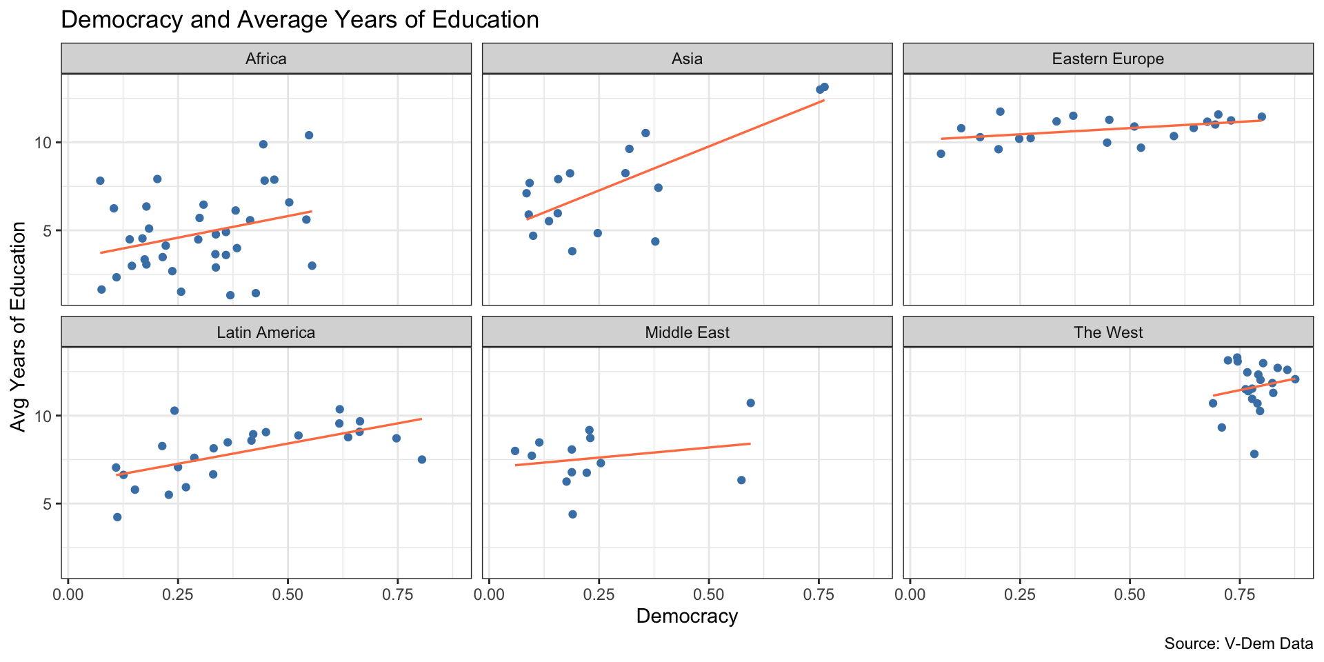
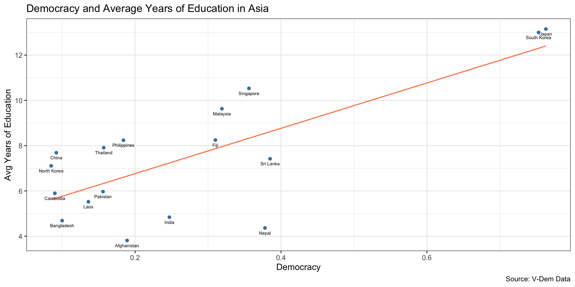
Last one . . . Labeling Points
geom_text()
myData %>%
filter(region == "Asia") %>%
  ggplot(., aes(x = v2x_egaldem, y = e_peaveduc)) +
  geom_point(color = "steelblue") +
  labs(x = "Democracy",
       y = "Avg Years of Education",
       title = "Democracy and Average Years of Education in Asia",
       caption = "Source: V-Dem Data")   +
        geom_smooth(method = "lm", linewidth = .6, color = "coral", se = FALSE) +
      geom_text(aes(label = country_name), size = 2, vjust = 2) +
  theme_bw()
Last one . . . Labeling Points
geom_text()
