# Create dataset for year 2022, with country name, year, and electoral dem
library(vdemlite)
vdem2022 <- fetchdem() %>%
  mutate(region = e_regionpol_6C) %>%
  mutate(region = case_match(region,
                        1 ~ "Eastern Europe",
                        2 ~ "Latin America",
                        3 ~ "Middle East",
                        4 ~ "Africa",
                        5 ~ "The West",
                        6 ~ "Asia")) %>%
  filter(year == 2022)  %>%
select(country_name, year, v2x_polyarchy, region, v2x_regime)Describing and Visualizing Variables
January 29, 2025
Outline
Describing and visualizing data
Practice with description and visualization
Next week: deeper dive on coding and other aspects of Data Visulalization
Types of variables
Numerical variables
- Continuous - infinite values
- Discrete - non-negative whole numbers
Categorical
- Ordinal – if there is a natural ordering
- World Region is categorical, but NOT ordinal
Start with summarizing a numerical variable
Let’s Use the V-Dem Data Again
Electoral Democracy Measure
To what extent is the ideal of electoral democracy in its fullest sense achieved?
Measure runs from 0 (lowest) to 1 (highest) [0.5 is a cutoff they use for determining electoral democracy from electoral autocracy]
Clarification: The electoral principle of democracy seeks to embody the core value of making rulers responsive to citizens, achieved through electoral competition for the electorate’s approval under circumstances when suffrage is extensive; political and civil society organizations can operate freely; elections are clean and not marred by fraud or systematic irregularities; and elections affect the composition of the chief executive of the country. In between elections, there is freedom of expression and an independent media capable of presenting alternative views on matters of political relevance.
Other High Level V-Dem Democracy Measures
- Liberal Democracy
- Egalitarian Democracy
- Participatory Democracy
- Deliberative Democracy
Describe and Summarize
How can we use our data to describe or summarize the state of electoral democracy in the year 2022?
Create the data
Examine the data
Rows: 179
Columns: 5
$ country_name  <chr> "Mexico", "Suriname", "Sweden", "Switzerland", "Ghana", …
$ year          <dbl> 2022, 2022, 2022, 2022, 2022, 2022, 2022, 2022, 2022, 20…
$ v2x_polyarchy <dbl> 0.571, 0.775, 0.896, 0.897, 0.664, 0.711, 0.817, 0.091, …
$ region        <chr> "Latin America", "Latin America", "The West", "The West"…
$ v2x_regime    <dbl> 2, 2, 3, 3, 2, 2, 3, 0, 1, 2, 1, 0, 2, 2, 2, 3, 3, 1, 1,…
How can we summarize electoral democracy?
“Typical” values
Shape of the distribution
Spread of the distribution
“Typical” Values
We could calculate the mean (mean)
“Typical” Values
We could calculate the median (median)
Describe and visualize the distribution
We can describe the shape of the distribution
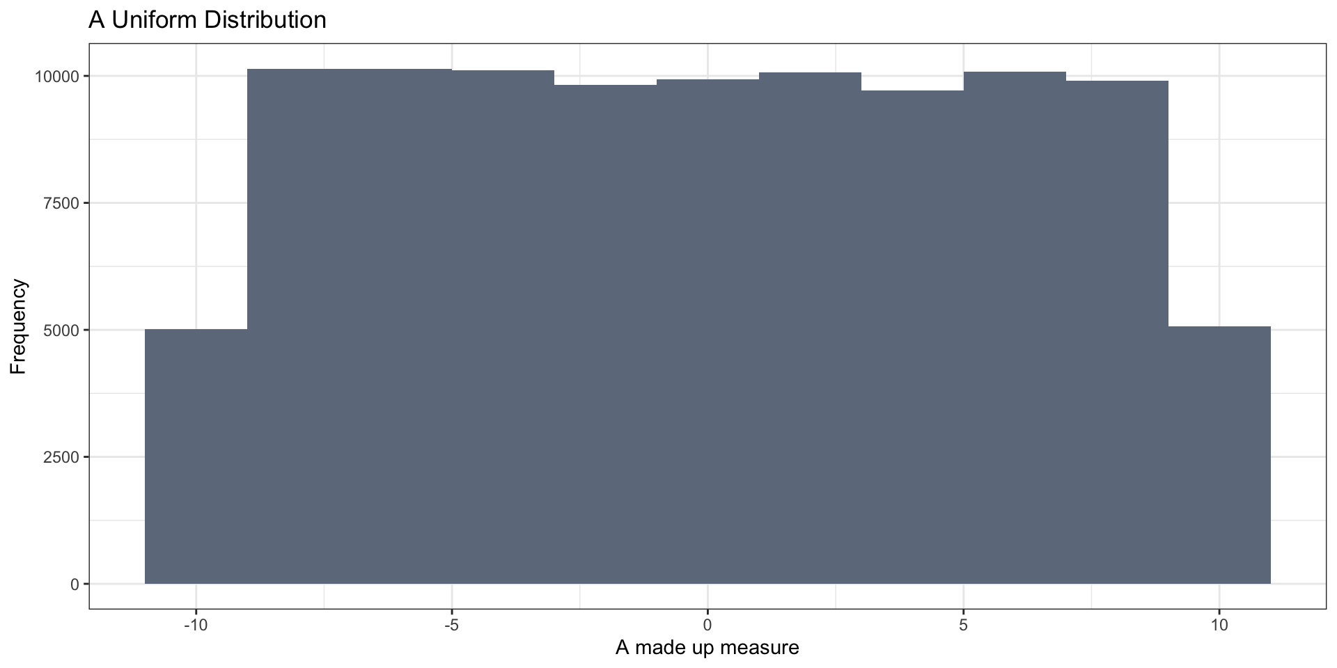
- symmetric
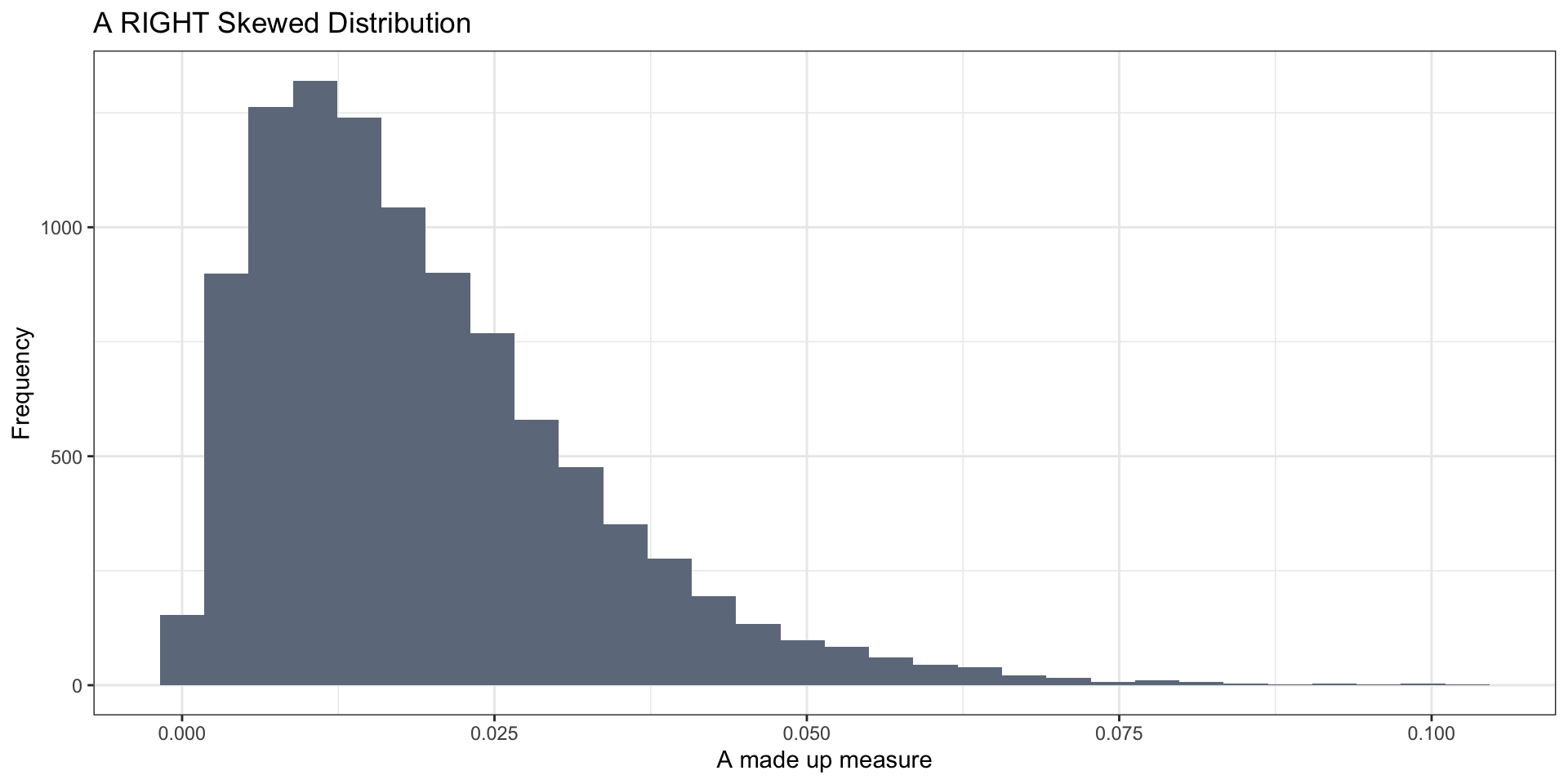
- right-skewed
- left-skewed
- unimodal (one peak)
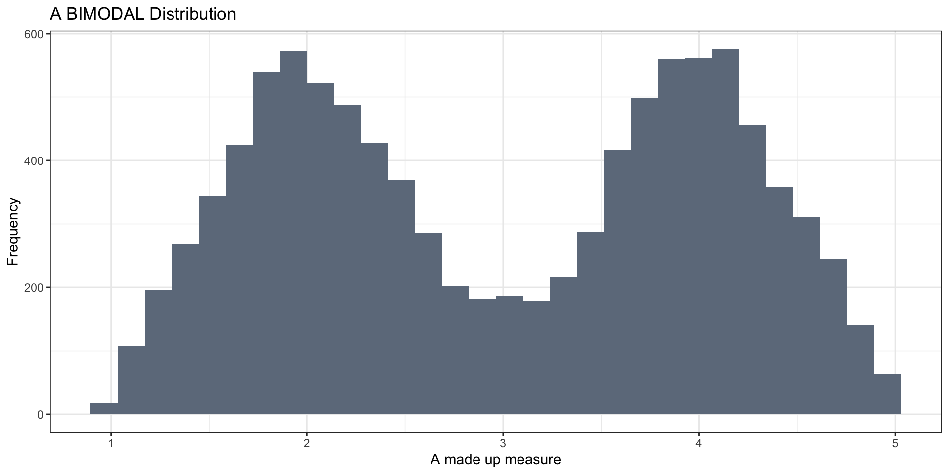
- bimodal (multiple peaks)
Symmetric distributions
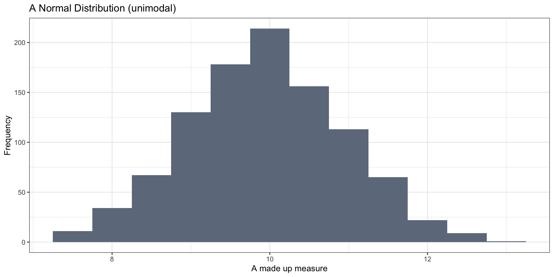
Symmetric distributions
Skewed Distributions
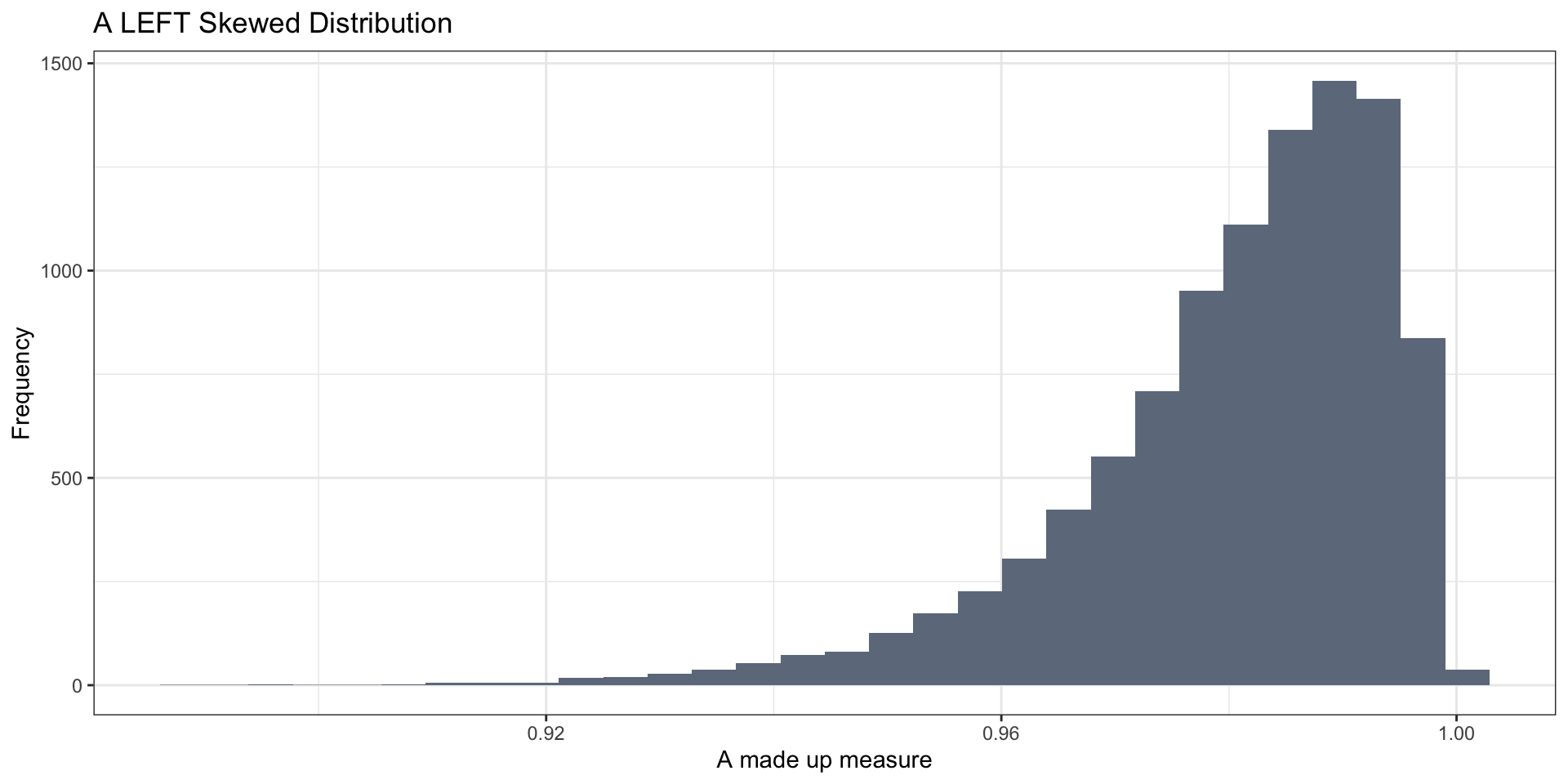
Skewed Distributions
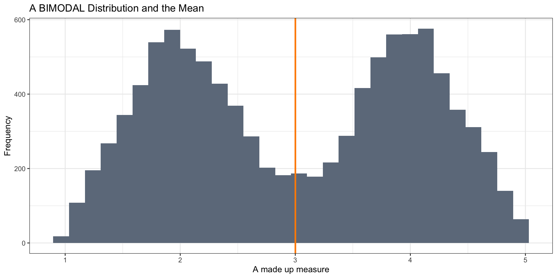
Bimodal Distribution
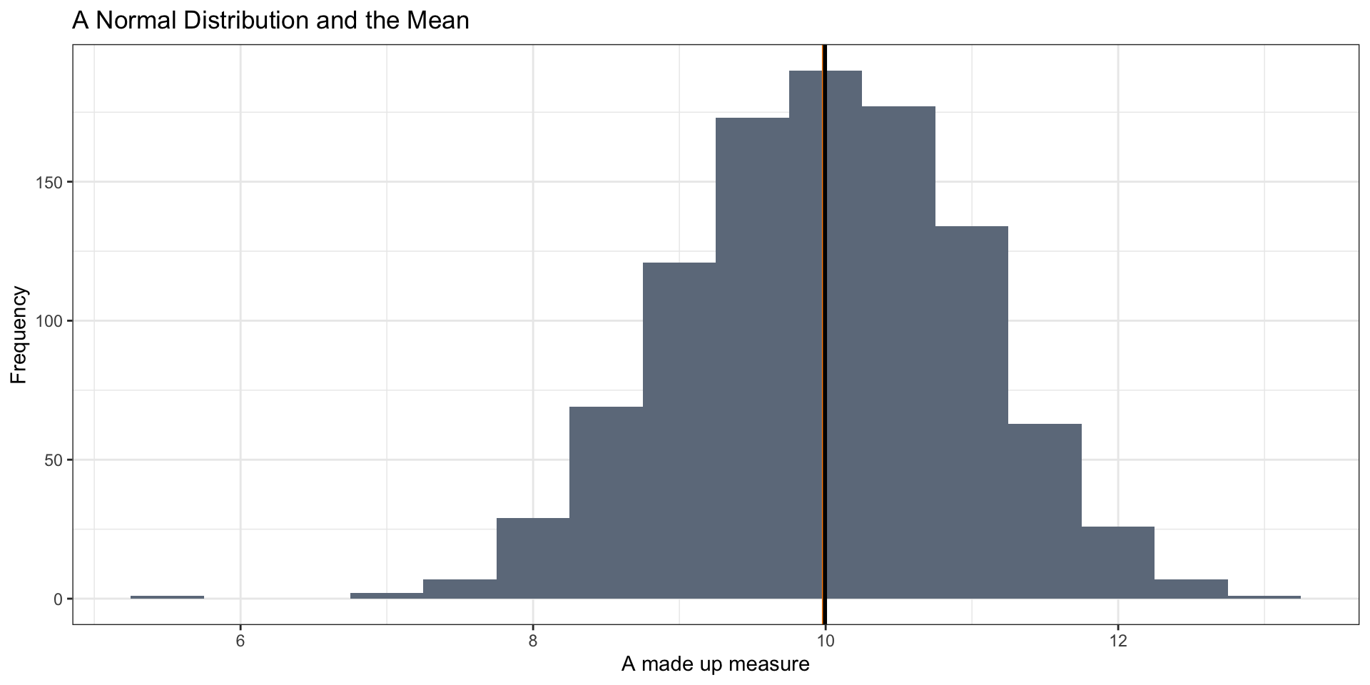
Mean vs Median
Mean vs Median
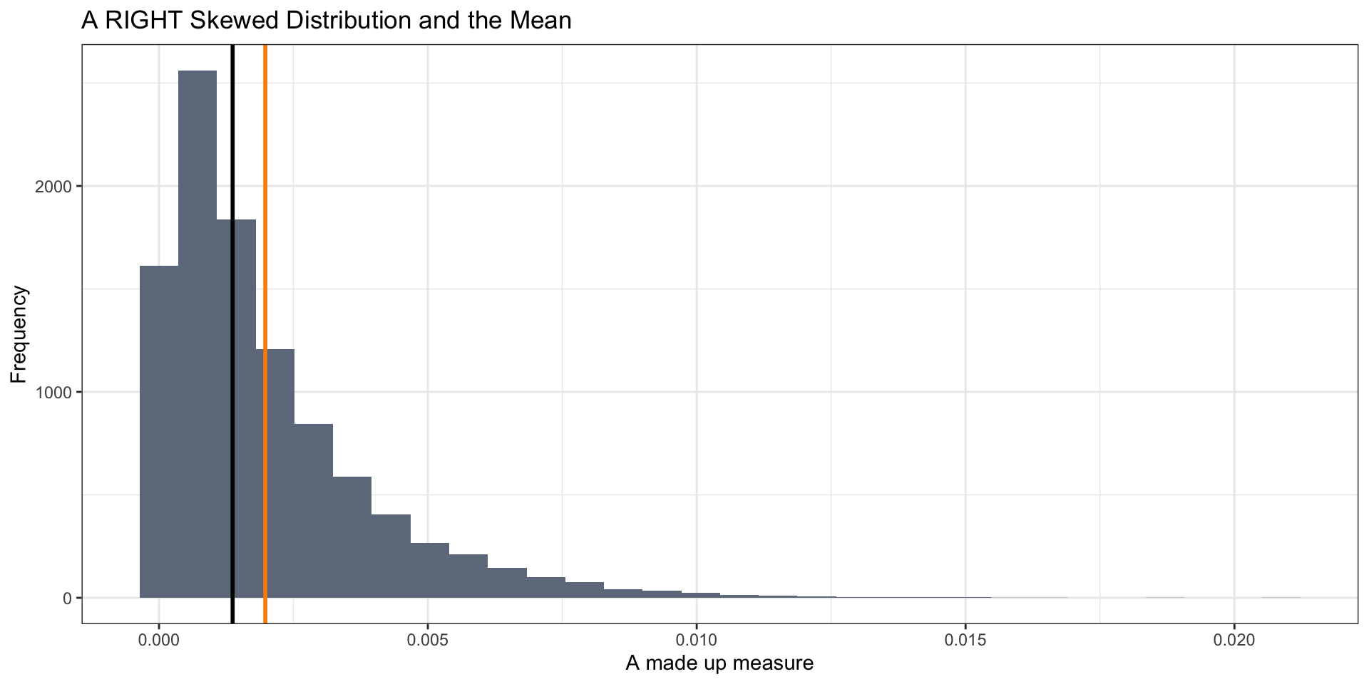
Mean vs Median
Mean vs Median
the Mean works well as a summary statistic when the distribution is relatively symmetric
Not as well when distributions are skewed or bimodal (or multi-modal)
- With skewed distributions, the mean is sensitive to extreme values
The median is more robust
Lesson
Always look at your data
When reading or in a presentation, ask yourself:
- Does the mean make sense given the distribution of the measure?
- Could extreme values in a skewed distribution make the mean not as useful?
- Have the analysts shown you the distribution? If not, ask about it!
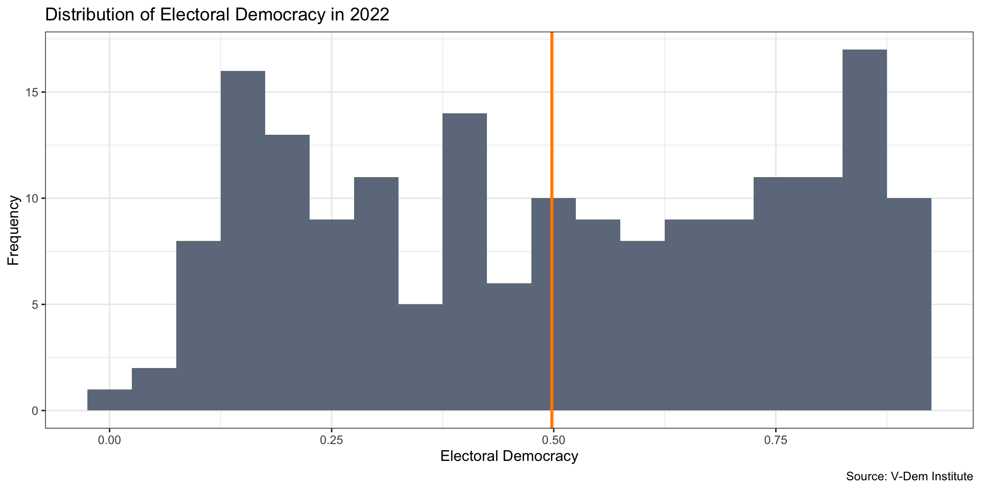
Visualize Our Measure
Recap
We can use statistics like mean or median to describe the center of a variable
We can visualize the entire distribution to characterize the distribution of the variable
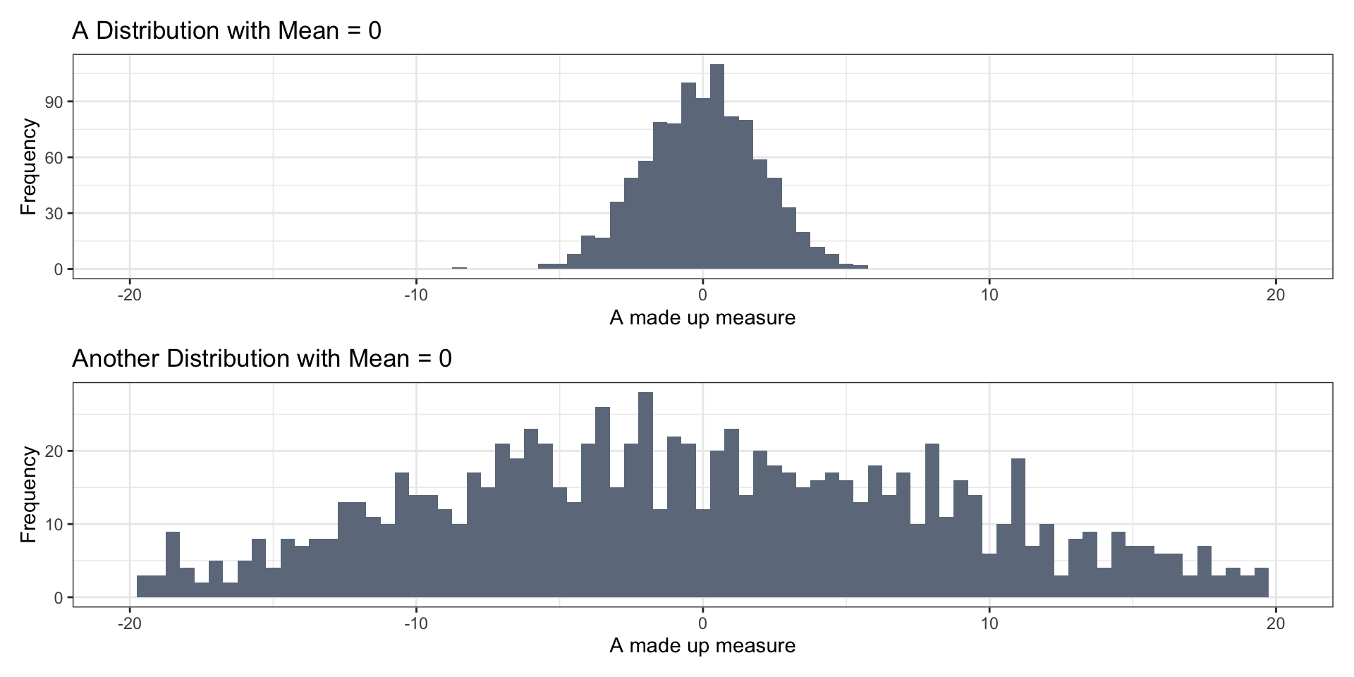
We should also say something about the spread of the distribution
Why Measure and Visualize Spread?
Measures of Spread
Range (min and max values)
- Not ideal b/c does not tell us much about where most of the values are located
Interquartile Range
IQR: 25th percentile - 75th percentile

Interquartile Range
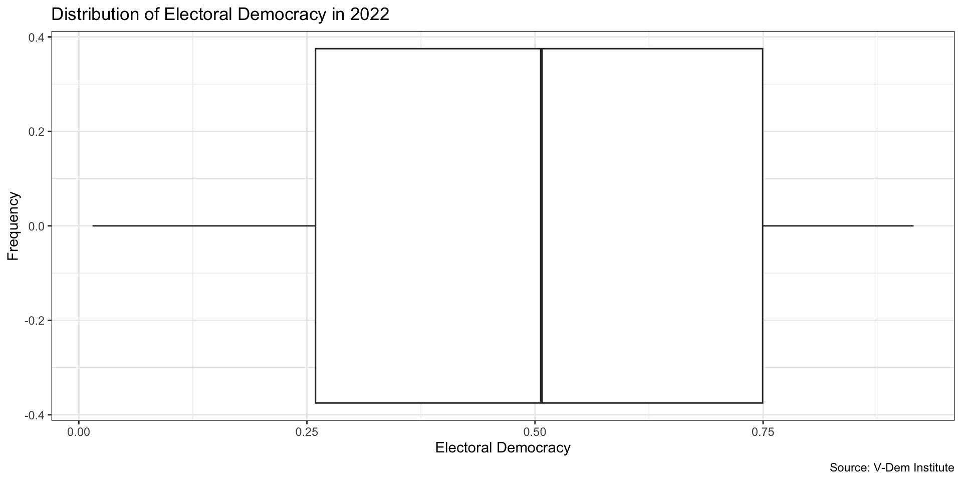
The middle 50 percent of the countries in the data lie between 0.262 and 0.747
The range length of 0.485 tells us something about the spread of the distribution
The Box Plot
Measure of Spead: Standard Deviation
Standard deviation
Can think of this as something like the “average distance” of each data point from the mean
Measure of Spead: Standard Deviation
- Can think of this as something like the “average distance” of each data point from the mean
Standard Deviation Simple Example
Standard Deviation Simple Example
- First, we calculate the variance:
- For each point, we calculate the deviation from the mean: \[e_i = X_i - mean(X)\]
- For the point where the value is 0, this is: 0-5 = -5
- For the point where the value is 10, this is: 10-5 = 5
- Then we square all of the \(e_i\) –> \(e_i^2\), and add them up
- Why do we square them?
Standard Deviation Simple Example
Then we divide by \(N-1\), the number of observations, to get an average squared deviation from the mean
Finally, to get standard deviation, then take the square root of the variance
- This transforms the variance back into the units of the original variable (it basically undoes the squaring we did before)
Standard Deviation Simple Example
Standard Deviation Simple Example
Standard Deviation Simple Example
Standard Deviation Simple Example
Standard Deviation Simple Example
Questions?
Calculating Statistics by groups
- What if we want to describe electoral democracy and see how it differs by some different variable? For example, by world region, or by year?
Calculating Statistics by groups
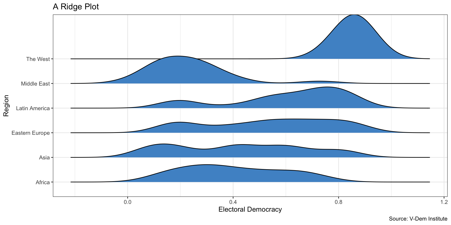
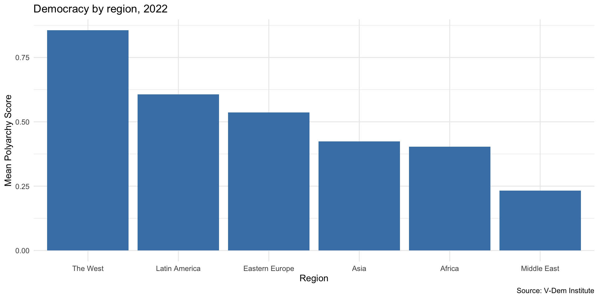
Let’s calculate the mean and median of electoral democracy in each world region
For this, we add the group_by() to our previous code
vdem2022 %>%
  group_by(region) %>%
  summarize(mean_dem = mean(v2x_polyarchy),
            median_dem = median(v2x_polyarchy))
# A tibble: 6 × 3
region mean_dem median_dem
<chr> <dbl> <dbl>
1 Africa 0.403 0.377
2 Asia 0.423 0.412
3 Eastern Europe 0.537 0.564
4 Latin America 0.607 0.685
5 Middle East 0.232 0.208
6 The West 0.856 0.855Calculating Statistics by groups
- Let’s store our statistics as a new data object, democracy_region
democracy_region <- vdem2022 %>%
  group_by(region) %>%
  summarize(mean_dem = mean(v2x_polyarchy),
            median_dem = median(v2x_polyarchy))

democracy_region
# A tibble: 6 × 3
region mean_dem median_dem
<chr> <dbl> <dbl>
1 Africa 0.403 0.377
2 Asia 0.423 0.412
3 Eastern Europe 0.537 0.564
4 Latin America 0.607 0.685
5 Middle East 0.232 0.208
6 The West 0.856 0.855Visualize using a Bar Chart
Break
Categorical Data
Data that fit in categories
Regime type
Region
Likert scale: Very Bad, Bad, Neutral, Good, Very Good
- This kind of scale is ordinal: there is a natural ordering to the categories
V-Dem Regimes of the World Measure
- Closed Autocracy
- Electoral Autocracy
- Electoral Democracy
- Liberal Democracy
Data Setup
Describe regimes of the world in 2022
We could take the mean ….
Describe regimes of the world in 2022
Wait, no we cannot
Describe regimes of the world in 2022
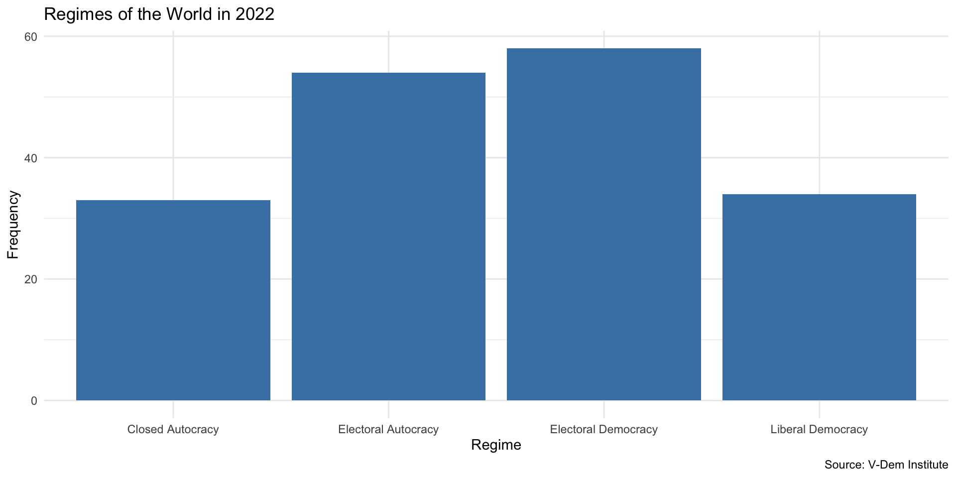
We could count the number of each regime type
Describe regimes of the world in 2022
Contingency Table
Bar Plot is Usually Better
Summarizing a categorical variable by a goup
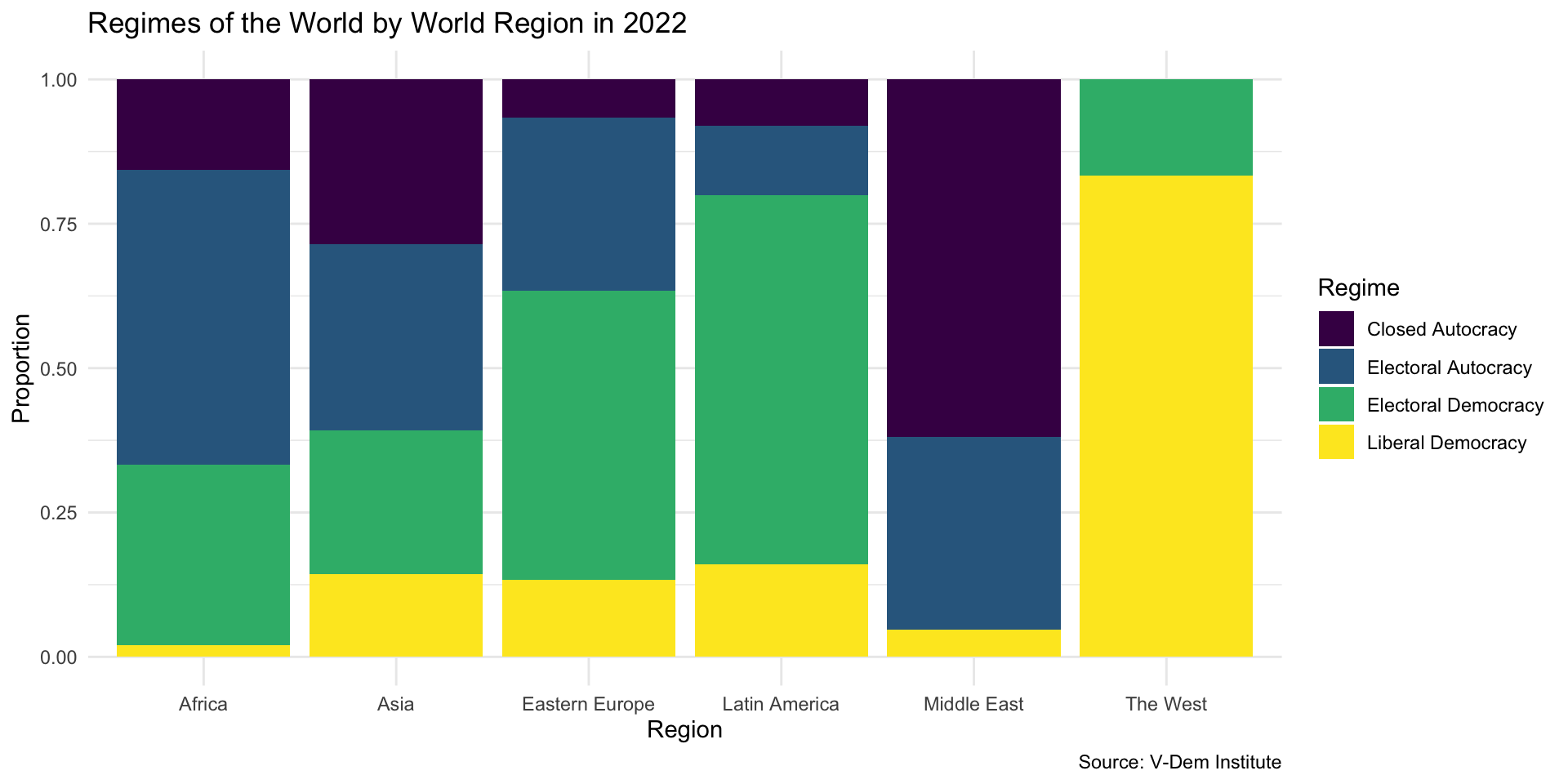
How do Regimes Vary by Region?
How do Regimes Vary by Region?

How could we improve this graph??
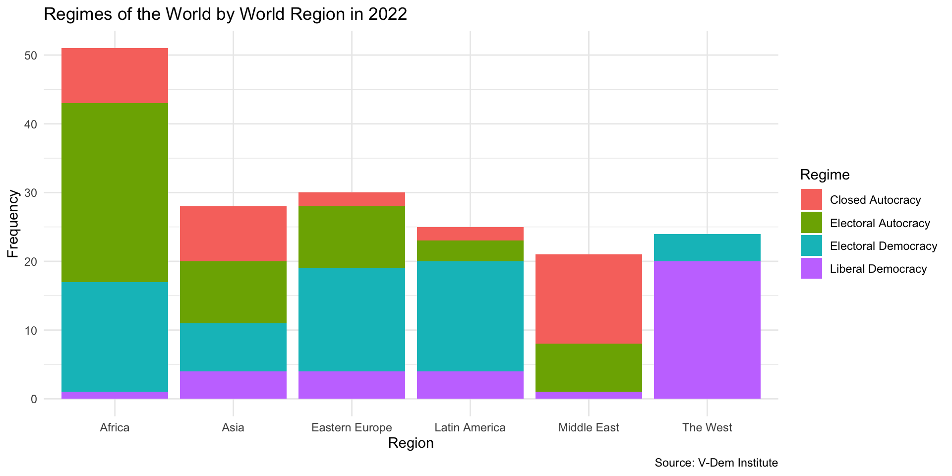
Colors need improving
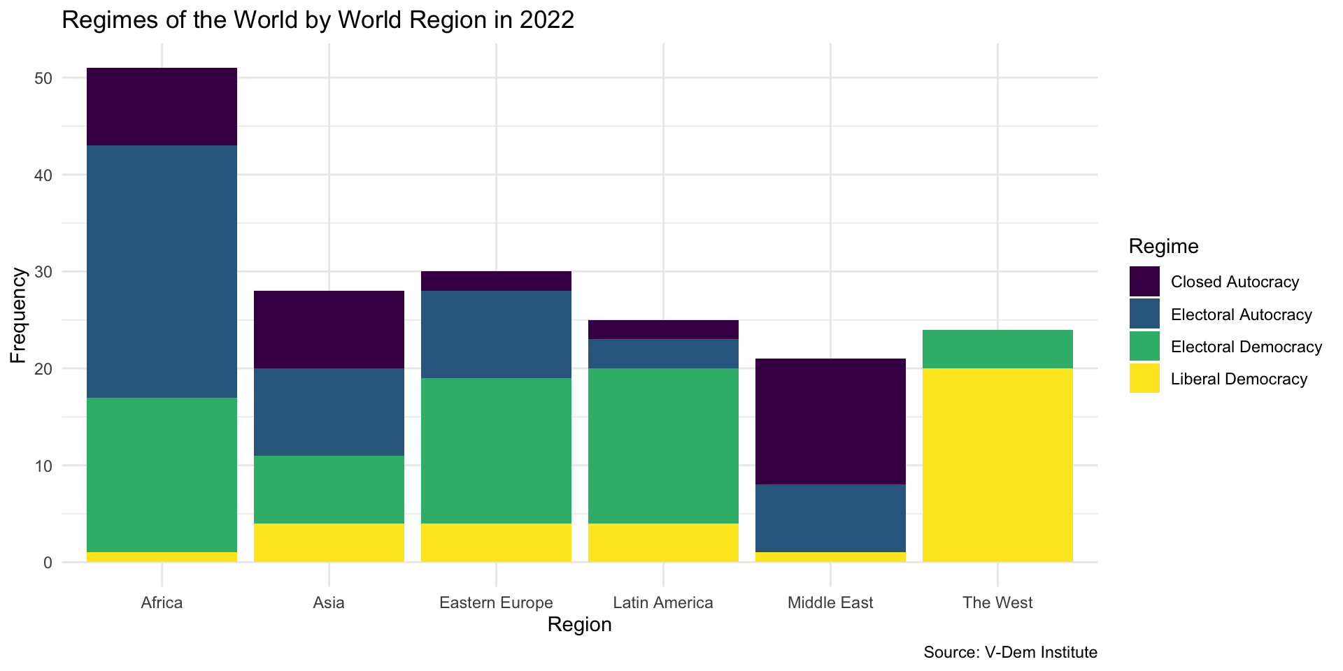
Region Size
Some regions have more countries than others. Why does this create an issue for telling a story with our data here?

Is this better?
Numerical Variable by Group
How should we interpret this plot?
