library(tidyverse)
library(vdemdata)
myVdem <- vdem %>%
   filter(year == 2018)  %>%
 mutate(region = e_regionpol_6C) %>%   ## make a better region variable
  mutate(region = case_match(region,
                        1 ~ "Eastern Europe",
                        2 ~ "Latin America",
                        3 ~ "Middle East",
                        4 ~ "Africa",
                        5 ~ "The West",
                        6 ~ "Asia")) %>%
  select(country_name, v2x_polyarchy, e_gdppc, region,  e_wb_pop) %>%
  mutate(lg_gdppc = log(e_gdppc))
#names(vdem2019)
#glimpse(myVdem)Relationships between Variables
May 19, 2025
Visualize with a Scatter Plot
How would you interpret this plot?
Code
ggplot( myVdem, aes(x = e_gdppc, y = v2x_polyarchy)) +
  geom_point(color = "steelblue4") + # use geom_point() for scatter plots
  scale_x_log10(labels = scales::label_number(prefix = "$", suffix = "k")) +
  labs(
    x= "GDP per Capita",
    y = "Polyarchy Score",
    title = "Wealth and democracy, 2018",
    caption = "Source: V-Dem Institute",
    color = "Region",
    ) +
  scale_color_viridis_d(option = "inferno", end = .8) +
  theme_bw()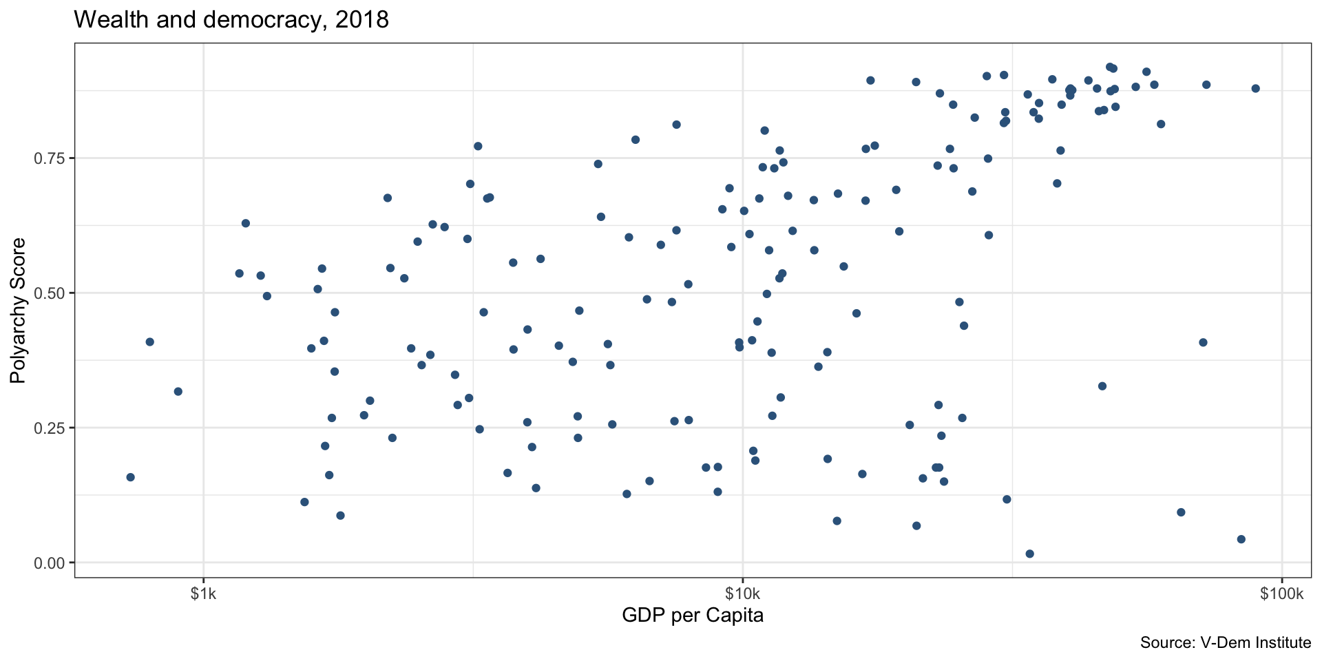
Trend line
The trend line visually illustrates the relationship
Code
ggplot( myVdem, aes(x = e_gdppc, y = v2x_polyarchy)) +
  geom_point(color = "steelblue4") + # use geom_point() for scatter plots
  geom_smooth(method = "lm", linewidth = 1) +
  scale_x_log10(labels = scales::label_number(prefix = "$", suffix = "k")) +
  labs(
    x= "GDP per Capita",
    y = "Polyarchy Score",
    title = "Wealth and democracy, 2018",
    caption = "Source: V-Dem Institute",
    color = "Region",
    ) +
  scale_color_viridis_d(option = "inferno", end = .8) +
  theme_bw()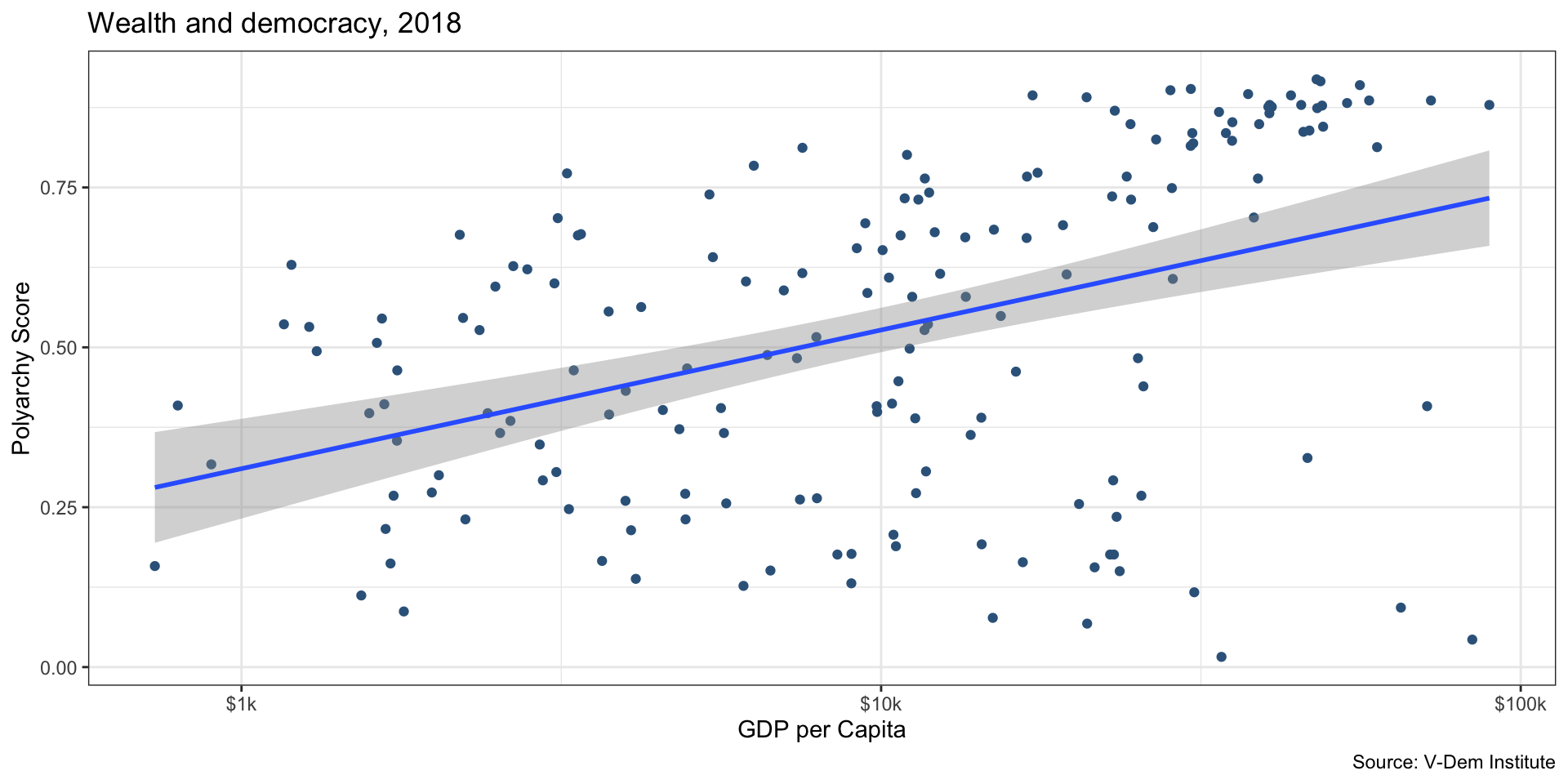
Add a dimension: World Region
Code
ggplot( myVdem, aes(x = e_gdppc, y = v2x_polyarchy)) +
  geom_point(aes(color = region)) +
    geom_smooth(method = "lm", linewidth = 1) +
  scale_x_log10(labels = scales::label_number(prefix = "$", suffix = "k")) +
  labs(
    x= "GDP per Capita",
    y = "Polyarchy Score",
    title = "Wealth and democracy, 2018",
    caption = "Source: V-Dem Institute",
    color = "Region",
    ) +
  scale_color_viridis_d() +
  theme_bw()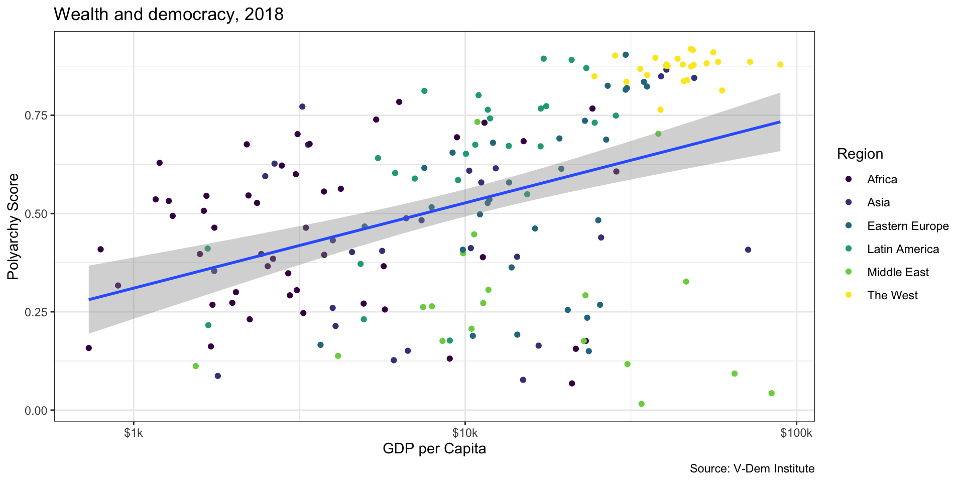
Add another dimension, Population
Code
ggplot( myVdem, aes(x = e_gdppc, y = v2x_polyarchy)) +
  geom_point(aes(color = region, size = e_wb_pop)) +
    geom_smooth(method = "lm", linewidth = 1) +
  scale_x_log10(labels = scales::label_number(prefix = "$", suffix = "k")) +
  labs(
    x= "GDP per Capita",
    y = "Polyarchy Score",
    title = "Wealth and democracy, 2018",
    caption = "Source: V-Dem Institute and World Bank",
    color = "Region",
    size = "Population"
    ) +
  scale_color_viridis_d() +
  theme_bw()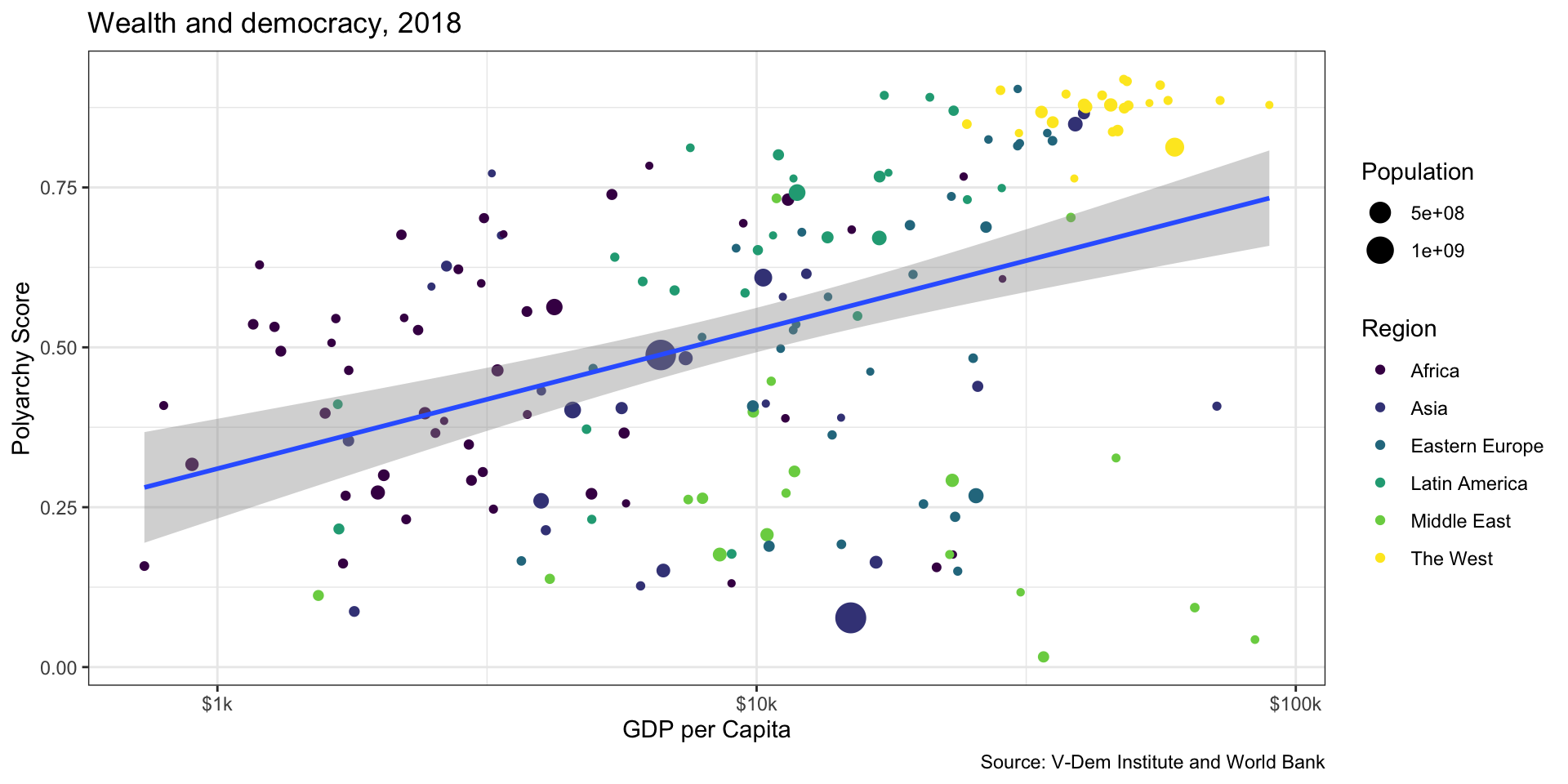
Relationship by Region
Relationship might be different, but this is a bit hard to read
Code
ggplot( myVdem, aes(x = e_gdppc, y = v2x_polyarchy, color = region)) +
  geom_point() +
    geom_smooth(method = "lm", linewidth = 1, se=FALSE) +
  scale_x_log10(labels = scales::label_number(prefix = "$", suffix = "k")) +
  labs(
    x= "GDP per Capita",
    y = "Polyarchy Score",
    title = "Wealth and democracy, 2018",
    caption = "Source: V-Dem Institute",
    color = "Region",
    ) +
  scale_color_viridis_d() +
  theme_bw()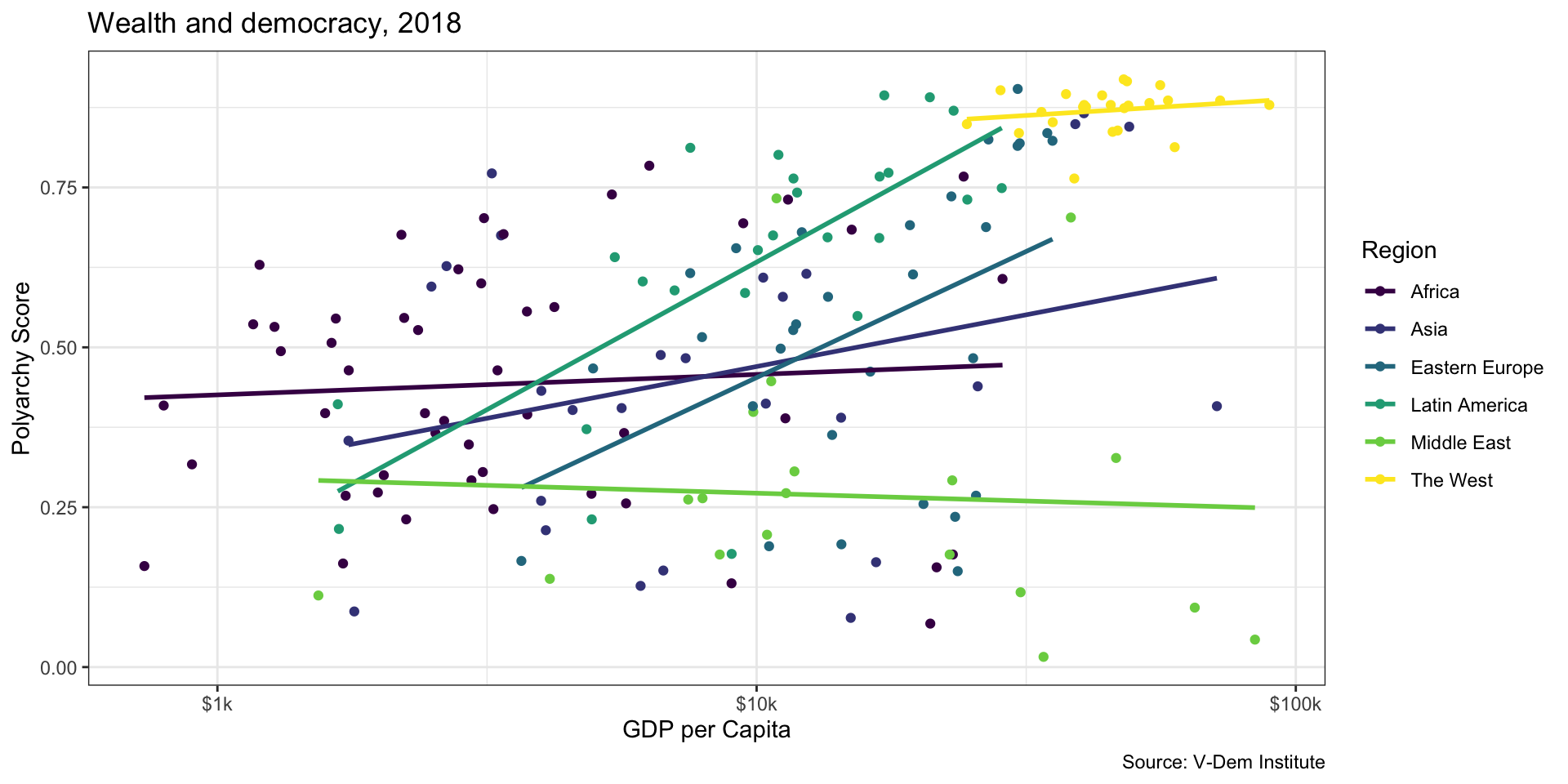
Facet Wrapping
How should we interpret this plot?
Code
ggplot( myVdem, aes(x = e_gdppc, y = v2x_polyarchy)) +
  geom_point() +
    geom_smooth(method = "lm", linewidth = 1, se=FALSE) +
  scale_x_log10(labels = scales::label_number(prefix = "$", suffix = "k")) +
  labs(
    x= "GDP per Capita",
    y = "Polyarchy Score",
    title = "Wealth and democracy, 2018",
    caption = "Source: V-Dem Institute") +
    facet_wrap(~region) +
  scale_color_viridis_d() +
  theme_bw()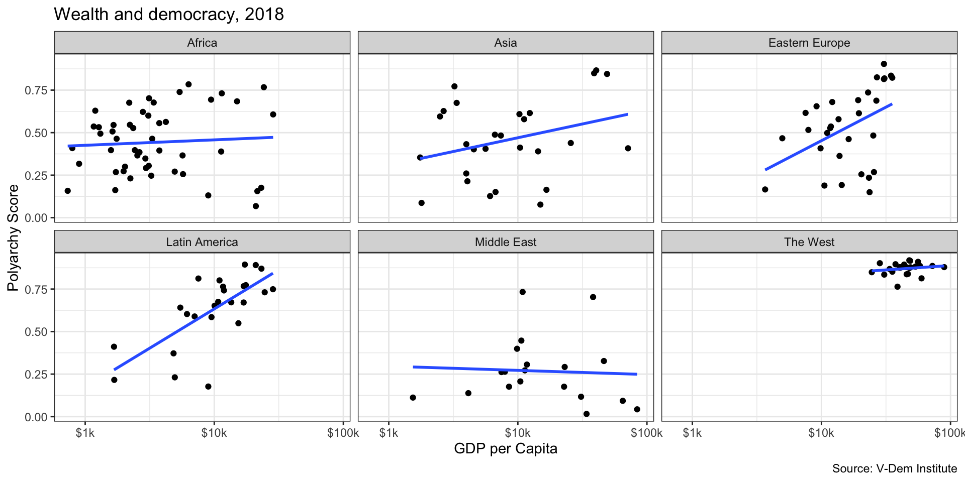
Examine Specific Countries by Labelling Points
Code
myVdem %>%
  filter(region == "Africa") %>%
  ggplot(. , aes(x = e_gdppc, y = v2x_polyarchy)) +
    geom_point(color = "steelblue4") +
    geom_smooth(method = "lm", linewidth = 1, se=FALSE) +
    geom_text(aes(label = country_name), size = 2, vjust = 2) +
scale_x_log10(labels = scales::label_number(prefix = "$", suffix = "k")) +
  labs(
    x= "GDP per Capita",
    y = "Polyarchy Score",
    title = "Wealth and democracy in Africa, 2018",
    caption = "Source: V-Dem Institute"    ) +
  scale_color_viridis_d() +
  theme_bw()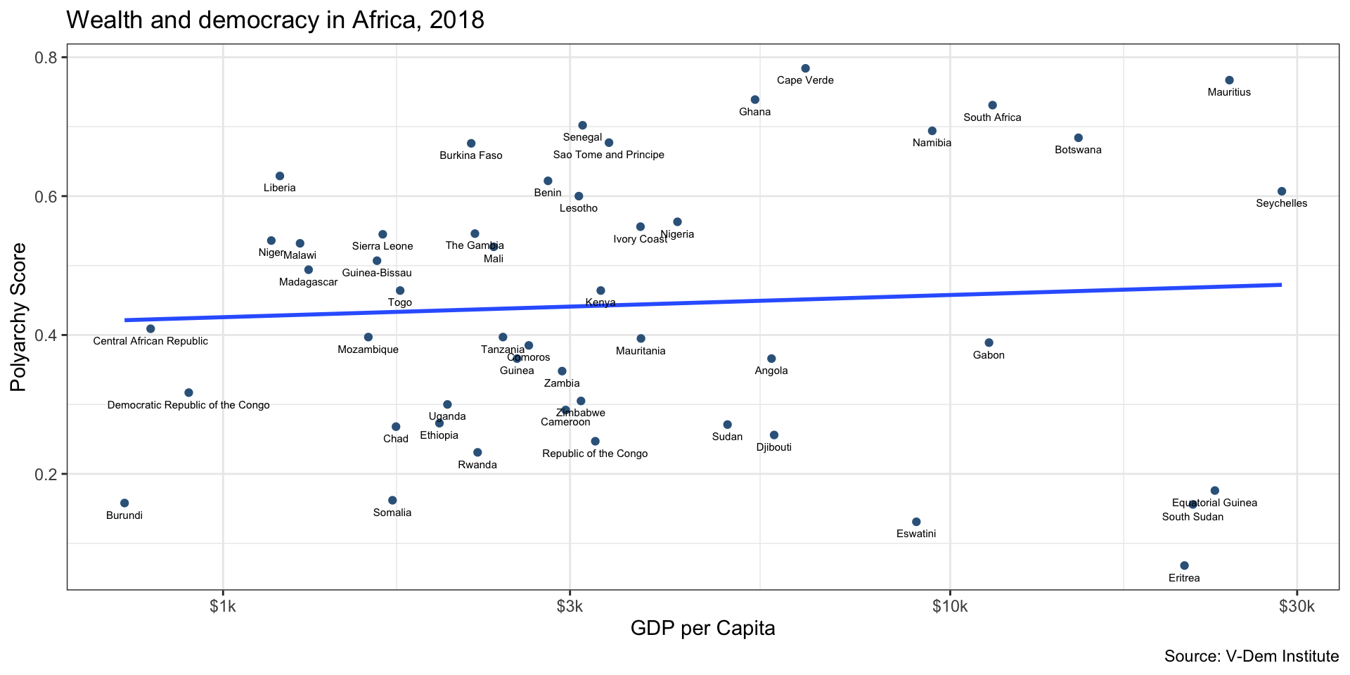
Examine Specific Countries by Labelling Points
Code
myVdem %>%
  filter(region == "Asia") %>%
  ggplot(. , aes(x = e_gdppc, y = v2x_polyarchy)) +
    geom_point(color = "steelblue4") +
    geom_smooth(method = "lm", linewidth = 1, se=FALSE) +
    geom_text(aes(label = country_name), size = 2, vjust = 2) +
scale_x_log10(labels = scales::label_number(prefix = "$", suffix = "k")) +
  labs(
    x= "GDP per Capita",
    y = "Polyarchy Score",
    title = "Wealth and democracy in Asia, 2018",
    caption = "Source: V-Dem Institute"  ) +
  scale_color_viridis_d() +
  theme_bw()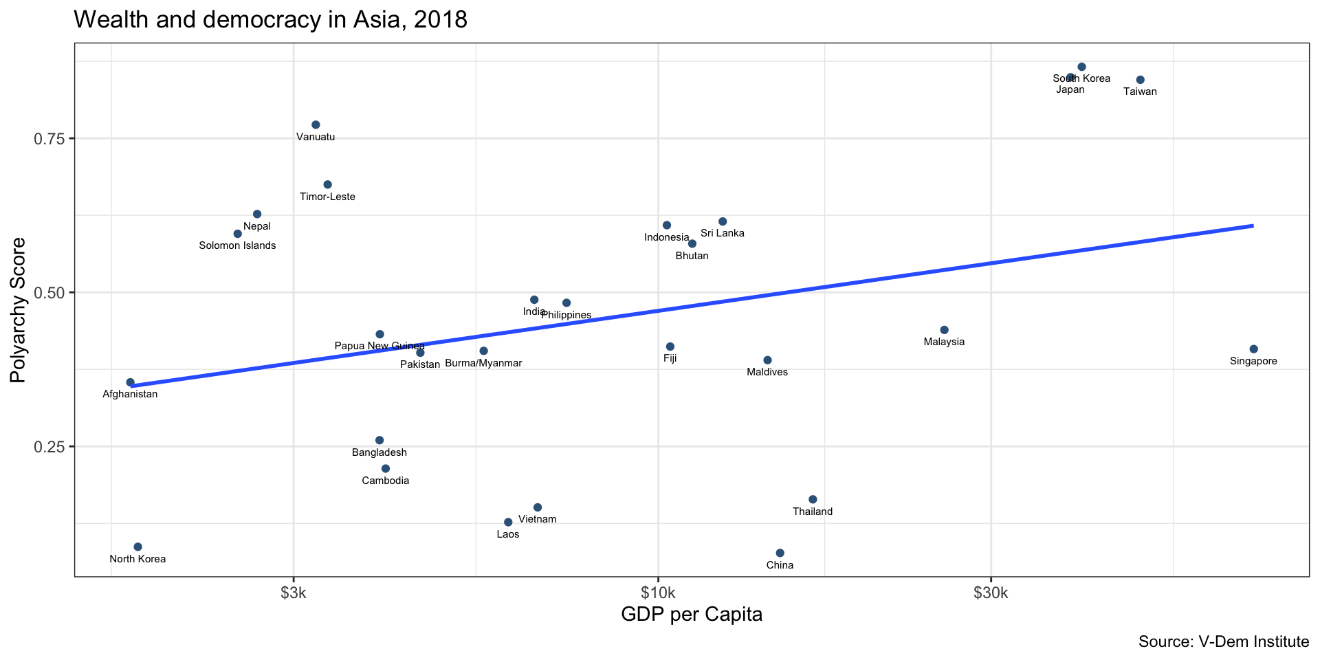
Make it Interactive with plotly
Code
library(plotly)
modernization_plot <- ggplot( myVdem, aes(x = e_gdppc, y = v2x_polyarchy)) +
  geom_point(aes(color = region)) +
  aes(label = country_name) +
  geom_smooth(method = "lm", linewidth = 1) +
  scale_x_log10(labels = scales::label_number(prefix = "$", suffix = "k")) +
  labs(
    x= "GDP per Capita",
    y = "Polyarchy Score",
    title = "Wealth and democracy, 2018",
    caption = "Source: V-Dem Institute",
    color = "Region",
    ) +
  scale_color_viridis_d() +
  theme_bw()
ggplotly(modernization_plot, tooltip = "country_name")
```
![]()